|
| Shelli Walters landscape |
 |
| Shelli Walters landscape |
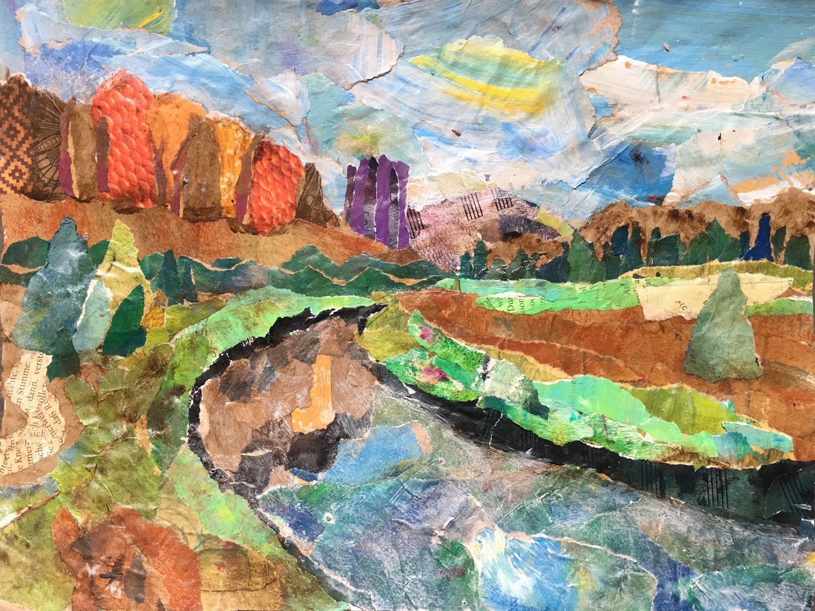
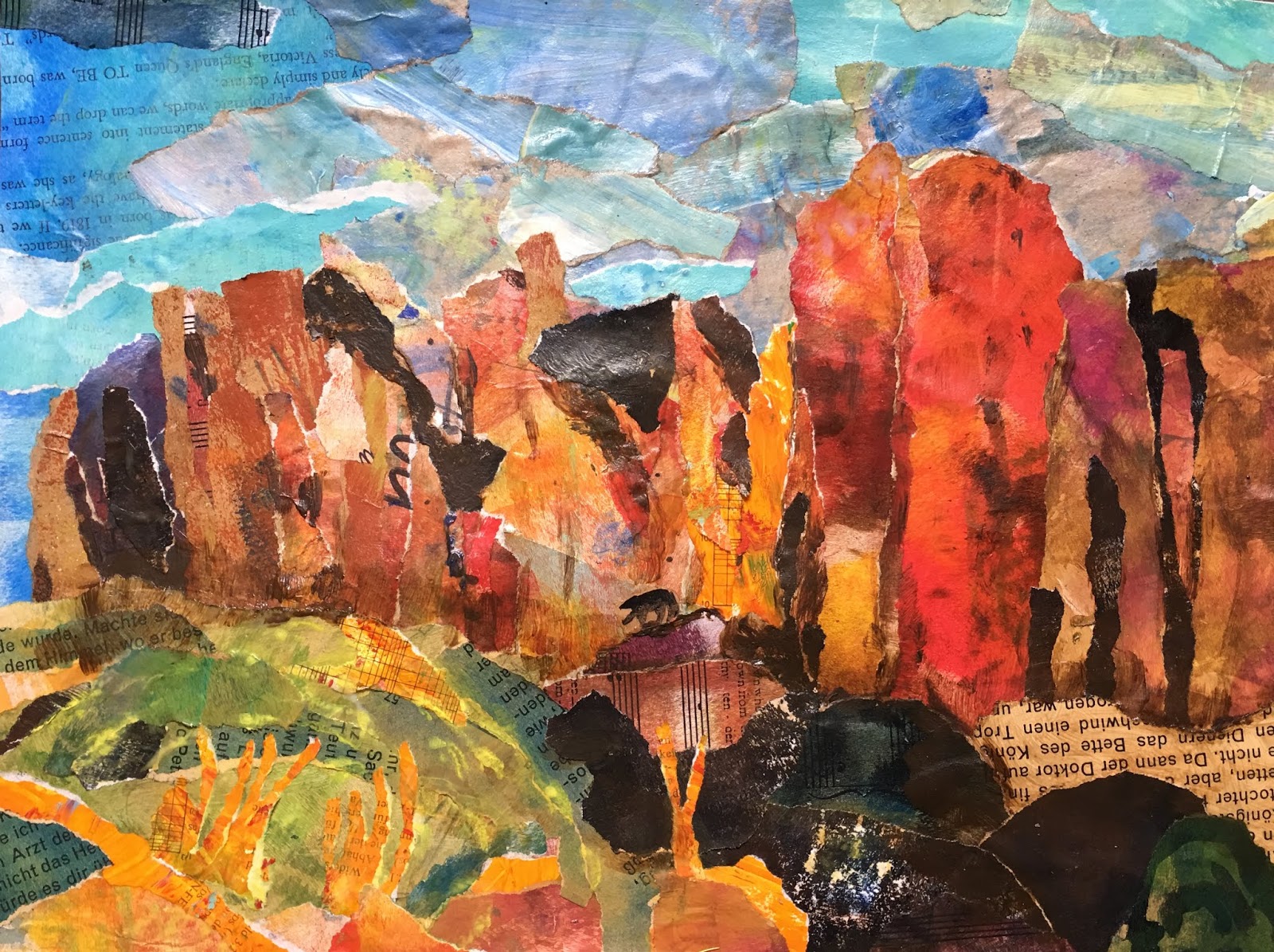
We looked at Shelli's Oregon landscape collages, which depict craggy rock cliffs, winding streams, and mountains. Much of her inspiration comes from the wild landscapes of Oregon's Fort Rock State Park and the Oregon high desert. I wanted my adults to create an original piece in Shelli's style so I printed out photos of landscapes from these areas.

What to think about when collaging a landscape:
A. Collaging a landscape is tricky. I decided the important this was to ensure that our landscape had a defined foreground, middle ground and background, some kind of obvious rock cliffs or mountain, an area of water, and a defined sky. If all these elements are place, it would likely be unmistakable that we are depicting a landscape.
B. Additionally, each area would have its defined color scheme, to separate it from the other areas: the sky would be cool color, the mountains and cliffs would be warm colors, the water would again be cools, and any tree or grassy area would be greens. This devision through color helps the eye wander through the picture and understand that we are looking at.
C. The other important tip to consider when collaging a landscape, is to paste the papers in such a way that they mimic the direction, flow and shape of what's being represented. So the cliffs are pasted with vertical strips of roughly torn paper, and water is pasted in horizontal pieces of unevenly torn paper.
D. No hard edge or corners should be uses. For a more organic shape, paper should be torn, not cut.
F. Another key factor is to match the values in the landscape. This helps us separate and define the contours and the dimension of the different elements.
We used a wide range of collage papers in every color and tone including book paper, grid paper, atlas paper, painted paper, plain colored paper and patterned decoupage paper. I also painted paper in warms tones (particularly, reds, oranges and browns) and in cool tones, as options for our rocks, grassy and water.
We use acrylic gel medium for pasting, but mod podge would work too. The rule is 'paste under the collage paper, then over top again'.
As a final touch, we used a tiny touch of diluted white acrylic paint to soften our sky, and a tiny bit of diluted brown, dark green or blue (or some other dark color) to enhance the dimension around some of our elements. We used acrylic gel medium to dilute our paint. Our goal was just to soften, push back, or deepen some areas with the paint, not to paint over the paper, so strongly diluted the paint was important.
These turned out fabulously! My adults were seriously proud. It took us one 3-hour class.