I did her horse and barn with my kids a few years back (see post here.), and I wanted to revisit her for a Valentine's project. I adore her head collages. The mix of patterns, details and tiny images, all put together into a viably pleasing and exciting whole, was right up my alley, and I knew my kids would enjoy recreating this.
 |
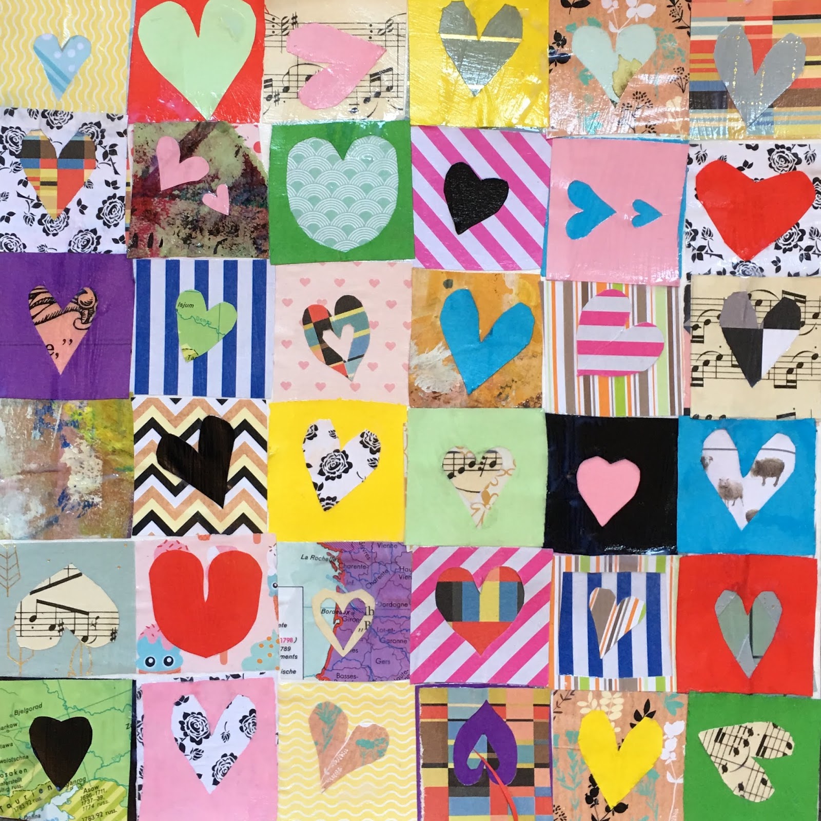
| Elizabeth Rozen Collage Heart |
 |
| Elizabeth Rosen Collage Hearts |

Contrast, Balance, Variety, Unity, Emphasis and Harmony
Objective:
Students had to create 8x8 squares of hearts using both the positive and negative space of their heart cut outs. They could add another smaller details or symbols to their squares, but each square HAD to have a heart in it. The art principles had to be strictly considered.
Contrast:
When choosing paper students had to consider contrast. Their heart paper should stand out against their background square paper.
Emphasis:
Their hearts should be emphasized somehow, either by consideration of color, pattern or placement, by adding a contrasting contour, or through size.
Variety:
Students had to use many different papers - plain colored, patterned, painted paper, book paper, atlas paper, etc. Hearts should also be cut out in different sizes, shapes and styles, and placed in different positions.
Harmony and Balance:
Students had to use each of their papers of choice more than once throughout their composition, to create harmony and balance, and to create a visually pleasing whole.
Materials:
-32x32 cm thick watercolor paper
-Acrylic gel medium or mod podge for pasting
-Collage papers of various colors, patterns. I use paper from old books, dictionaries, textbooks, atlases, novels, grid paper, colored contraction paper, patterned decoupage paper, and painted paper.
(Collage paper should be pre-cut into 4x4cm squares)
Scissors and brushes for pasting


 Step 1
Students pasted collage paper squares down on their paper, 8 squares across and 8 squares down. For contrast and balance, they were not allowed to place two same or similar papers near each other. For balance and harmony, papers had to be repeated elsewhere in the composition.
With gel medium or mod podge, the rule is 'paste under and over'. This glues and seals our collage paper.
Step 2
Student began cutting out hearts and placing them throughout their composition, in different shapes, sizes, styles and with added details. Again, serous consideration of contrast, balance, variety, emphasis and harmony was at play here.
To cut out hearts, students lightly folded the square paper in half and cut along the folded line, not all the way to end. This way we have a heart, and its negative space, which we also used in our composition. Using not only the positive space of our heart but also the negative spaces helps up create balance and harmony, since we are repeating that paper color and pattern.
I was giddy with excitement to see what creative ideas my students came up with to add to their hearts, such as arrows, keys, wine bottles with a heart label, twin interlocked hearts, stacked hearts, etc. Such fun!
I found that students had a pretty good intuitive understanding of these art principles when placing their papers. Often, they would take their heart and moving it around hovering above their composition, until they found the 'right' spot for it.
This project took two 90-minute classes. My students are between 8-14 years old. They all did a fantastic job and learned a whole lot along the way about art principles!