Wednesday, September 26, 2018

Bikes with Complementary Paint Splatter

7-8 year olds
To begin the new art semester for my little class (7-8 year olds) I wanted to do projects focusing on line and observational drawing, since these are fundamental to almost all the projects we'll be doing this year. And because we have a long summer break behind us, a line-focused project which exercises our fine motor skills and strengthens our observation skills, will get us back on the art track.


Bikes are challenging, fun to draw, and something all my students can relate to. They certainly tick off the element of line (curved, circular, straight, short, long, diagonal....  and the element of shape since we closed all our bike lines to create a bike frame (shapes) which we could then color. Other art thinking which cropped in to this project were symmetry, proportion, value (highlights and shadows created with marker), spacing, design and craftsmanship (overall neatness, closed line points, clean lines, careful coloring, etc).
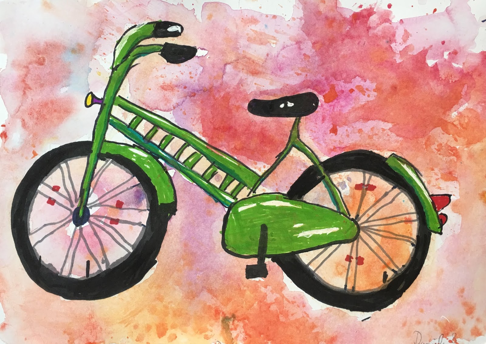

Teacher Sample

Bike Analysis
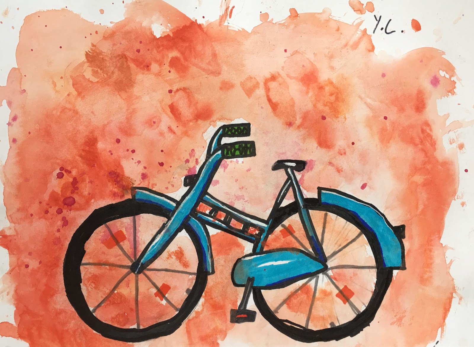
The objective was to draw a unique bike that appears 3-D. My students had visuals of bikes in many different styles at their table. We discussed what the frames looked like, where the wheels attach to the frame, where the seat and handlebars extend out from, where the pedal is attached, etc. Seeing many different bikes gave them ideas for their own bike.

Guided Drawing
We began with a guided drawing on the white board to get them going. First, we established where our wheels would go. They needed to have space at the bottom of the paper, and the same width of space on both the right and left sides of their paper. They used their fingers to measure this space. This helps them both center their bike for good visual composition, and will guarantee that they have enough space for their bike drawing to extend high above the wheels. Without this guide, most kids would probably plop their wheels down in the center of their paper, and they'd run out of space for their handlebars. No good.
We used empty masking tape rolls as wheel templates. Once we knew where our wheels would go. we traced in the inner circle for the wheel, and then around the outside for the bike tire, but you could also just free-hand the bike tire if you want it thicker than the template allows. Then we traced our second wheel. You could also use a ruler and draw a light line at the bottom of the paper where the wheels will go, to ensure that both wheels are solidly placed on the same hormonal line. But eye-balling this worked too.
Then we drew step-by-step: the chain cover starting in the center of the back wheel; mud guards on both wheels; the front frame (which is slightly slanted), the crossbar connecting the chain cover to the from handle bar; the two-pronged frame section that the seat sits on (we noted that the front frame where the handlebars is and the central frame where the seat is slant slightly to the same degree, so they are parallel.... a math concept that was beyond this age group, but they got the visual understanding that the bars slant the same way); the pedal; grips, etc. Students were shown options for details and looked at their bike visuals for ideas like lights, cross bar designs, bells, etc. We kept the spokes easy, by just doing the simple 'pizza slice' lines.

Corrections
We analyzed our bikes and made corrections where things did not line up, or where proportions were off. Some students extended their handle bars, enlarged their seat, or drew their grips larger. Recognizing what doesn't look 'right' and correcting it, is what makes us better artists, so this step is an important exercise.

Outlining
Once we had all our lines in place where we wanted them, we traced them with a black permanent marker and erased our pencil lines. We used a gray marker to trace the wheel spokes to create some softness, and so as not to overdo the black lines.

Coloring
I knew we'd be adding watercolor splashed backgrounds to our bikes, so we used waterproof Sharpie markers to color our bike, to prevent the ink from bleeding later. Students where to choose one color for their bike, and it's lighter value, so for a blue bike, students chose a middle blue and a lighter blue. We established our light source, and then colored the whole bike frame in our middle color, leaving out a strip of white where our highlight is. The only way to create white space with marker is to NOT COLOR THAT SPACE. Some kids found it easier to 'draw' in the white space (for example, a long oval shape along the top of their cross-bar), and then color around it. With our darker color, we added our shadows, which would be anywhere that is under, behind, beneath, overlapped by something etc. The kids got this concept easily. Bike tires were colored in with a thick permanent black marker. Seats and handle bars were also colored with attention to highlights and shadows. Now our bikes look 3-D!

Paint Splatter
We used a wet-on-wet watercolor technique to create the background and chose the complementary color to our bike. We wet our paper all around our bike with a medium brush, and then loaded up the brush up with lots of water and our color and simply dabbed it all around our paper. We then chose a second color NEXT TO our first color on the color wheel (analogous) and repeated. Students were encouraged not to scrub or 'paint' with their brush, but instead, dab and stipple the color onto their paper and let it do it's wet-on-wet magic. This creates more texture. Students were also encouraged to leave a 'frame' of unpainted space along the edges of their paper and not go all the way to the edge.

Voila! Adorable, proportional, detailed, 3-D bikes. My students loved this project.


Monday, September 17, 2018

Personalized Name Bikes

Jure Zaech designs
Juri Zaech design

I've been wanting to try out these personalized bike frames with my students for a while, ever since I learned about the Swiss designer and typographer Juri Zaech. I think the idea of a name bike frame is just wild and so original, and one my 8-14 year old kids could get behind with enthusiasm. Additionally, I was looking for a perfect project to start the new Art Room fall semester. Last year, we did a graffiti project as our first project of the fall semester, and this bike project covered all the same territory and more! It was a great way for my students to get back into the art swing of things after a long summer break: line, shadows, highlights, dimension, proportion, precision, color, emphasis, design and design development are all elements, principles and areas we considered in this project.
Teacher Sample

Teacher Sample
To start, we talked about scripts. I handed my kids several different script fonts I'd downloaded from the internet. This allowed them to see how letters swing and curve into each other, and how much variation there is in different scripts. This was especially important for those kids who had never learned to write cursive in school. My kids come from two different school systems: The German school system, which teaches cursive writing in second grade, and the International school system, which did away with cursive instruction all-together. We practiced our names on scrap paper many times over, using different scripts, or just exploring script. We knew our names would be turned into bike frames, so had to consider a placement for our bike seat and handlebars. If we thought our name was too short, or not suitable, we chose our second name or our last name. Like designers, students were problem-solving, experimenting, and finding solutions to make their names fit into their concept: where will the bike seat go? how will I incorporate the handle bars into my first letter? where might I attach the wheels? how much room must I leave for the wheels? is my name too short? is my name too long? (if so, could I make a two-seater bike?)....


When we had our name and our script chosen, we got out the good paper and began carefully drawing our name. I used marker paper for this project, because it holds the marker color much better than regular printer paper, which often tears and gets distressed. Marker paper allows the marker to glide on smoothly, and absorbs the color just enough without tearing, allowing the color to stay vibrant.

Names: Students were encouraged to center their name, with equal space to the right and left of their name, and enough space at the bottom of their name for wheels and shadows. Placement (composition) is important! We drew lightly with pencil (something I stress again and again), so we could erase and correct if needed. Once names were drawn, we doubled up our lines and created thicker lettering, so we could color it in later (going from line, to shape). This reminded us of the graffiti lettering we did last year. 
Enthusiastic bike frame designers

Details: Once we had thick name lettering, we added our seat, our handle bars and grips. I had many visuals of bikes, in different styles, so kids could look closely at how to draw handlebars and seats, and how they are placed in relation to each other. Some kids had to be encouraged to draw their seats larger - we discussed proportion and scale.....

Wheels: For the wheels we used empty masking tape rolls as tracers. We were careful to find the right placement for our wheels - not too far apart, not too close together. Students used a ruler to create a horizontal guide for placing their wheels on the same line - we did not want one wheel higher or lower than the other!

Spokes: The spokes were tricky. I did not want to draw simple 'pizza pie' spokes, with lines coming out vertically from the wheel center. I wanted students to attempt 'proper' spokes, which are slightly crossed over each other, and which spiral in both direction from the center. We watched a simple youtube tutorial on how to draw spokes, then I demonstrated a few times on the white board before students practiced on their scratch paper. It took a few attempts, but we finally go it!

Day 1 complete
Coloring: We wanted a 3-D looks, so highlights and shadows were critical. Students chose a light source, and then colored accordingly. We chose one color, plus a lighter and/or darker value of that color (for example: RED, plus dark red and pink). I demonstrated that when coloring with marker, strong highlights (white areas) must be left uncolored. To do this, we used our lightest base color and drew in our highlight shapes where we wanted them, then colored in our whole bike, going around these shapes, leaving them white. We then added a middle value and shadows with our middle and darker colors. We noted that shadows go anywhere where one part of our lettering crosses over top of another part, underneath our lettering, in corners and at the far side from where our light source is coming from. Similarly, highlight are close to the light source, facing the light source, or near the top of lettering.  Seats, handlebars and grips also had highlights and shadows.

Finishing Touches: With a fine liner black permanent marker, we went over our contour lines where we felt it was necessary, either to add an additional darker edge to our shadow sides (creating more dimension) or to lightly contour or emphasize the whole bike (for example, if our bike color was light).

Shadows: To give our bikes some weight and grounding, we added a fine wheel shadow. Using a piece of vine charcoal, we etched a bit of chalk right under the wheel, then with our finger, we pulled the chalk outwards to the left and to the right, in a large arched motion, fading the shadow as it extends downwards, because shadows get lighter as they extend away from their object. We talked about cast shadows, and how the sun, when it shines from behind you, makes your shadow look larger than you.... so it was with our wheels. 

This project took two-90 minute classes. All my students, aged 8-14, went home feeling accomplished. They loved this project.