Wednesday, October 24, 2018

Watercolor Cactus Composition

The cactus theme was all over the place this spring and summer. On bags, clothes, jewelry, napkins, you name it. I avoided the hype as long as I could, but finally caved and decided I just HAD to do a cactus project with my kids. Following the earlier projects we've done this fall semester, which incorporated line, value, shadows and highlights, this cactus project was a great extension and further skills builder. In addition to line, value, and thinking about light source, we also considered watercolor techniques, texture, variety, dimension and composition.
Ages 8-10
Ages 8-14

Objectives and process - Day 1
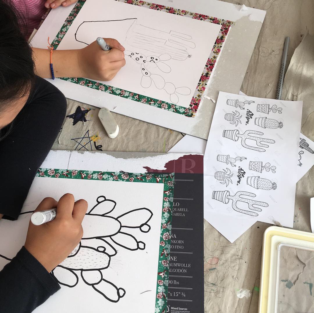
--Drawing the cactus composition


Students had to create their own, unique cactus composition with a minimum of 4 cactuses. To achieve variety, each cactus had to be of a different type, size, height, width and with a different texture (or hairs, prickles, thorns). Students had to think about good composition: cactuses had to overlap and fill the page, but not go off the page. They had to extend toward both sides and top. Students looked at both radial and triangular compositions to help them. Pots must be drawn with attention to form, so they look 3-D, and they must be placed on a table top. No floating pots please! After drawing our composition out in pencil, we traced all our lines using different widths of permanent fine-liner markers. Really small and fine details was traced using the thinnest width (such as cactus hairs and flowers), while more centrally important and larger areas were traced in larger widths. We do this not only for emphasis, but also because the varying widths create visual rest and variety. Once traced, pencil lines are erased.

Objectives and process - Day 2
--Painting the composition


Students used the wet-on-wet watercolor technique to paint their cactuses. Color had to be light, transparent and ethereal - this means wetting the surface of the space to be painted first, then dropping in some color and allowing it to spread. Students were encouraged not to overwork their paint, but rather, just let it do it's wet-on-wet thing. Students had to consider where their light source is, and paint their cactuses accordingly. If the light comes from the left side of their paper, then the left side of all their objects, including cactuses, cactus arms, flowers, terra-cotta pot, should be lighter than the opposite side. To achieve this, students dabbed less color into the highlight side of their cactuses, and added extra color into the shade side of their objects to get a darker value. Again, they were encouraged not to overwork or scrub their paint around, but just let the watery color bleed and blend. We looked at lots of watercolor cactuses I printed from the web, so they could see the wet-on-wet effect and the soft changes in value that comes from allowing colors to bleed and spread when dropped into wet areas. 

*Painting tip: 
To prevent the color from one cactus from bleeding into the next cactus, we skipped over a cactus when painting, so there is always 'dry' space between our wet spaces. Watercolor will only go where the paper is wet, so this technique of 'paint-skip-paint' helps us control unwanted bleeding across different spaces. With watercolor, controlling the water was key! Students should not wet their areas too much, or their color will pool and puddle. If and when this happens, we can dab up a bit of water up with a tissue. This also gives us a neat texture and creates more transparency. 

*Note on using tissue:
I allow for using tissue when we want to achieve specific texture, to achieve determined areas of highlight, or when water puddles out of control. However, students WILL abuse the tissue, dabbing away here, there and everywhere instead of controlling the water with their brush, which is how they SHOULD be working, so I keep an eye on them and will sometimes confiscate the tissue if I see a student is relying too heavily on it. The issue here is, that they are not learning how to appropriately control their water with their brush, and are using the tissue to clean up their all-too-wet, all-too-uncontrolled mess. Additionally, and importantly, dabbing everywhere with tissue creates a very flat image which lacks any and all value, intensity and texture. Not good art, and not a good learning experience.

Color: 
Students were asked to use many cool colors together, and to mix their own colors. Straight out of the paint pan colors were discouraged. Students had a scratch watercolor paper to explore their color mixing before painting on their final piece, and they were thrilled with the beautiful colors they were discovering. Blue-greens, green-yellows, green-browns, blue-browns, blue-yellows, blue-purples....so many beautiful combinations.
For variety, emphasis and interest, each cactus variety had to be a different color.

Brushes: 
As always, students had access to various brush sizes when painting - larger for larger areas, and small, fine brushes for the smaller areas. 

Terra-cotta pot:
The pots were colored in the same way as the cactuses, using browns, ochres, yellows and oranges. We used a wet-on-wet technique, considered light source, and created that extra light side and that added darker value on the shade side. 

Background:
Tabletops were done in a light wash of a neutral color - many chose grey (black with plenty of water), and the walls were done in a color that off-set the cool colors of our cactuses (many chose pink). All were done in light washes of wet-on-wet color.

This project took two 90-minute classes. My students love drawing with pen and pencil, so this was really fun for them. Watching their compositions come to life, and look 3-D, with the addition of color and value, was exciting for them too. Thinking about composition, variety and detail was an exciting challenge and a useful skill. All went home feeling accomplished and proud.


Friday, October 5, 2018

Mixed-Media Potted Cactuses

Somehow I landed on a cactus trajectory after the summer vacation (seems fitting, I guess), and I had the urge to do cactus projects with all my age groups. The focus in the Art Room after the summer was on on line and watercolor, and a cactus project would allow me to bring both these ingredients to fore nicely.
For my 7-8 year old age group I opted for a potted cactus with simple patterned pot. The key to this project is outlining the objectives and requirements clearly and working in a step-by-step manner. So here they are:

Objectives:
  • Draw 3-5 different cactus varieties in pencil, with some overlapping. Smaller ones in the front, larger taller ones in back. There must be variety in cactus shape, size, hight, width; cactus prickles and hairs should vary too (some could be dots, dashes, v-shapes, x-shaped, etc). *We had tons of visuals and illustrations of different cactus varieties to work from.
  • Good Composition: meaning your cactuses must fill the page (but not go off the page). Smaller ones in the front, larger taller ones in back. Cactuses should head towards the right and the left of the paper (radial composition), not just be in a crowded, vertical bunch in the center (bad composition).
  • Pots with Form: pots or vases must be drawn to indicate they have form, meaning the top opening curve should mirror the bottom curve. Patterns inside the pot must also follow this curve, so the pot takes on the illusion of a rounded form. *After a few demos on the white board, and some practicing on their scratch paper, the kids got this idea down easily.
  • Finer-liner marker width variety: we used different marker widths throughout when tracing our pencil lines. Cactus contours were wider (0.5 fine liner), and details (such as flowers, prickles) were smaller widths (0.05, 0.1, 0.2, 0.3 width fine liners). Our pot contour was also wider than the patterns inside out pot. *This little details results in a much finer, cleaner composition, with emphasis and visual rest. Too many black lines of the same width is overwhelming to the eyes, and confuses the viewer because there is no emphasis. 
  • Patterns: these should be simple and should involve repetition (hence, pattern). *I had many visuals and examples of simple patterns they could explore.
  • Pattern Colors: choose 3-4 colors and repeat these colors in a patterned way in your pot. *We used permanent sharpie markers for our pots because I knew the rest of our drawing would be painted with watercolor and I wanted to avoid any marker bleeding. 
  • Wet-on-wet watercolor painting with attention to highlight and shadow sides of cactus paddles: Very light washes of blue, green and yellow mixes were dropped into out paddles wet-on-wet, and darker values were added to our shadow sides. *To prevent our colors from bleeding together across different paddles, we skipped around when painting, always leaving an unpainted area between our recently painted areas. The kids had fun mixing blues, greens and yellows. Purples was thrown in there too. Sand was painted in brown. Flowers were painted and refined with colored pencil. 
  • Background: Our backgrounds were painted wet-on-wet in a very light wash of a warm color to off-set our cool cactus colors. Some chose to use the dirty water from their water container, which was a murky, neutral color from all the color mixing we did.
  • Taped Borders: with most watercolor projects we do, I like to tape borders. It contains the paint nicely and leaves a clean, crisp border. 

We loved this project, and honestly, the kids really enjoyed the meticulous attention to detail, using different fine-liners, the color mixing and the mixed-media component. 


Day 1
Work in progress
Age 7

Age 8
Age 8
Age 7
Age 8
Age 8


Thursday, October 4, 2018

Bike Illustrations - Function, Form, Story-Telling and Setting

Teacher Sample
My 8-14 year old age group classes really loved the Bike Names project we did at the start of the semester, which was conceived as a way for them to exercise their line, art principles and design skills after the long summer break. I find my kids love the challenge of developing a drawing, paying attention to detail, personalizing a piece of art, and drawing with pen. For all these reasons and more, I knew I would extend the Bike Names project into an ultra detailed, hyper challenging piece. So, here we have it: Bike Illustrations with attention on Form, Function, Setting and Story-Telling. Additionally, this project required close observation skills, careful line work, developing a unique concept or idea, and continuous critical analysis of form and function. Like real designers, we were tasked with a myriad of complex problems required solving.  An exciting challenge!


Objectives
Bike Analysis:
To begin, we looked at many examples of bicycles in various styles, and analyzed their form and function. I printed out all kind of visuals, including illustrations, silhouetted bikes, simple drawings photos, etc. We asked ourselves many questions: What style does this bike have? What shape of frame? Shape of seat? Shape of handle bars? What makes it function? How does a mountain bike differ from a grandma-style city bike? How are the different elements connected to one another, for example, chain to chain ring, breaks to break wire and break clamps, mud guard to wheels, pedals to chain ring, etc. And by the way, we did not bother too much with all the 'correct' bike parts vocabulary. In fact, we were fumbling our way through all the names of these bike bits and pieces, multi-lingual and guess-working half the time, but bike vocabulary was not on the tippy-top of my list of important things to convey in this project. It could certainly be a great opportunity for technical vocabulary building with more time and dedication though.

Developing Idea:
Students were given scrap paper to sketch out preliminary ideas for their bikes. They had to consider their bike style with frame shape. They had to consider all the elements and details which would allow their bike to be functional, regularly asking themselves: does it go? Details details details! If you have a handle break, where does it connect to? Is your chain connected to the chain ring?
Illustrations are more interesting when they tell a story. Students had to add elements to their drawing which do just that. It could be as simple as a basket with flowers in it, or a balloon attached to the back of the bike.

Drawing:
Hard at work
Once we were happy with our ideas, we drew our bikes on good paper. We used marker paper because of its smooth surface, which accepts color and pen line really well. We used masking tape rolls as templates for wheels, then begin drawing in out various lines and details in pencil. We traced our pencil lines in fine liner marker in various widths. The smaller widths were for our tiny details, and spokes, while the bigger widths were for our frames and our larger areas. This gives variety and emphasis to our drawing.

Coloring:
We colored out bikes using one color of colored pencil, plus its lighter and darker shade. We considered our light source, and shaded our bikes accordingly, leaving areas uncolored or lightly shaded where there is light reflection. Colored pencils can be easily blended together for a seamless transition of values, and for a strong dimensional effect. Again, it's all in the details: even our seats, our bells, our flowers and our baskets have a shadow and a highlight side.
Setting:
To place our bike in a setting, we simply placed our marker paper, which is slightly transparent, over top of print outs of cityscapes (like New York, Berlin) or rows of houses (like Amsterdam, Brooklyn), and traced the lines with a pencil. There are plenty of options to choose from, which can printed from the internet by simply searching on Google images for 'row houses', 'Amsterdam town houses', 'Brooklyn brownstones' etc. We chose pencil in order to keep the background setting soft and distant, and to not interfere with our more important foreground subject.

Finishing Touches:
We added a dash of slight shadow under our wheels using a gray colored pencil.
We then pasted our paper onto black construction paper to give it a structured backing and to make our illustration pop.

My students loved this project! All ages, 8-14, were able to work at their own level and experience success. Win-Win.


Age 9

Age 10

Age 10

Age 8

Age 10

Age 9

Age 9

Age 9

Age 14

Age 8

Age 11

Age 13