Monday, June 25, 2018

Dandelion Puffs

For our last project of the Art Room year, I was looking for a quick and easy project that could be completed in one 90-minute class, and which would touch on some of the techniques and skills we learned this past year. I opted for this cute, easy and pretty much fool-proof dandelion project. It incorporates pen and line techniques, illustration, and watercolor techniques.... all things my 6-7 year old age group covered this year.

We began by looking at simple illustrations of dandelions. We noted their lines, the shape of their 'dandelion puff' (the white puffy stage of the dandelion, after it's seeded), and the shape and structure of the individual seedheads, which look like downey parachutes. We discussed how, when the wind blows, these seedheads blow off the puff and dance through the wind, disseminating the attached seed elsewhere. I demonstrated on the white board how we might illustrate seedheads. Students were given many options, from a double horseshoe shape, to a simple dotted shape. One student opted for little heart shapes.

Drawing
We began with watercolor paper, the borders of which I had pre-taped, and a pencil. I did a guided drawing demo on the board. Students had to draw three dandelions. For good composition, one should be larger than the others, and none overlapping, in the left half of their paper. We began with three simple circles, and added stems to these. We noted that dandelion stems are generally not super straight, but may have a slight curve to them. Then we sectioned our circles off into lines, the way you would cut a pizza or a pie. These initial lines are the outer seedheads. We then added extra shorter lines in between these longer lines, (slicing the pie even smaller) and made these shorter seedheads. Our goal was to draw full, fluffy dandelion puffs. Students each chose what kind of downey parachute shape they wanted at the end of their seedheadss. Most opted for a different shape for each of their three dandelions.

Just like in our pen and line techniques classes earlier this year, students were encouraged to draw carefully, neatly connecting their line points, and thinking of symmetry and even spacing. Where puffs looked too 'naked' students were encouraged to add some extra seedheads for a fuller puff.

Next, we drew a few detached seedheads dancing in the wind. These should be dancing towards the right side of our paper. For good composition, their placement should be varied with some upside-down, some sideways and one trailing off towards the top right corner. This carries our eyes all the way to the other end of the paper. We noted that the parachute shape on these should match the ones on our dandelion puffs.... since they originate from these puffs. My students got this concept without a problem!

We traced all our lines with a fine permanent marker and erased our pencil lines.
For that added illustration quality, we chose to write something whimsy at the bottom of our paper. Since these students are very young, and many are English as a second or third language learners, I wrote a few options on the board for them to copy, like 'Wish', 'Make a Wish', and 'Summer'.

Rubber Cement Resist
I opted to use rubber cement on our puffs to resist the paint. Rubber cement is a rather unfriendly glue which should not be breathed in. Because I did not want my young students working with this material I decided to apply it myself to their puffs. I worked at the wide open window sill and work briskly, applying the glue to each student's puffs as they brought their work to me after finishing with their pencil erasing. We then dried these with the blow dryer and moved on to our background.

Watercolor Background
We used a wet-on-wet watercolor technique for our background. We dropped dabs of 2-3 analogous colors on our wet background, moved the paint around a bit, but not overworking it. We applied salt and dabbed with a tissue for texture. There were then dried with the blow dryer.

Lastly, we rubbed the rubber cement glue off of our dandelions using a rubber cement eraser. I recommend using an eraser specifically for removing rubber cement, as regular pencil erasers will likely simply glide over the glue, smearing and smudging what's nearby, without properly lifting the glue. The lifted glue revealed beautifully white dandelions beneath our watercolored backgrounds.

Finally, we removed the taped borders for a crisp edge. Voila! A quick, fun and summery project incorporating pen and line, illustration and watercolor techniques. A great entry into summer!

Students aged 6 and 7


Sunday, June 24, 2018

Watercolor Whales

Michelle Fleur
Michelle Fleur
For our final project of the school year I wanted to do something that combined different elements of the learning we explored this last year. When I discovered the gorgeous watercolor whales and marine life of the Australian artist Michelle Fleur, I was instantly hooked. I knew that a watercolor whale project would ask my students to rehash and reawaken their learning, since it incorporates observational drawing, illustration, and watercolor techniques - all areas we explored in the fall semester. And it's a relatively quick project, meaning we could wrap it up in 1-2 classes, just in time for summer.

Last but not least, something about these ethereal, light watercolors reminds me of summer .... maybe the ocean aspect? Maybe the soft, delicateness of watercolor itself?
Who knows. But it certainly fit the bill.

As always, I do a few 'teacher samples' before doing projects with my students. This helps me work out the kinks, anticipate potential problem areas, and assess appropriate paper and media. We used watercolor paper and tube watercolors. Tube watercolors are heavily pigmented and a teeny bit goes a long way. I gave students a palette of 2 blues, green, purple and black, about a 1/4 pea size of each color, and it was more than enough. We taped the border of our paper with artist tape.

Teacher Sample
Teacher Sample


To begin, we looked at the work of Michelle Fleur and noted the texture, soft shifts in value, and the line work. We noted the light spots, and areas of her whales where there seems to be 'almost' an absence of color. We discussed the importance of working with see-through pigments, and gradually going darker when using watercolor. Key word: WATER color.... so lots of water to start, then gradually painting with more pigment and less water to achieve those darker values.

Practice
Practicing texture and values in watercolor
Each student was given a strip of watercolor paper. We drew 5-6 boxes on this strip, and in each box, following my lead, we explored watercolor techniques. Wet-on-wet, layering dry on wet, softening hard edges, going from dark to light, building up layers. Then we explored tricks to pull up the watercolor paint and reveal white: dabbing with a tissue, salt, alcohol spritz. We discussed brush work: instead of scrubbing the paint brush back and forth, which will overwork your pigment, soak and destroy your paper, we explored dabbing a paint-loaded brush on our wet paper (with a round brush, on a wet-on-wet surface) and then 'leaving it alone' to do it's thing (blend and bleed). This allows for the white of the paper or the lightest areas to stay intact, and will give you that light, airy, etherial and textured quality. This was hard for some students. Students will often overwork the paint with watercolor, scrubbing until their paper is raw, and creating a flat, even-toned application of paint with little to no variation in value. Students had to be encouraged to let the watercolor do it's thing, while still controlling the medium to achieve our goal: soft gradations in value, no hard lines, lightness (unpainted, or barely painted areas) and values dark enough to create contrast and dimension.  Not an easy task.

Drawing
I provided students with many photographs of whales, and had students choose one. Our goal was to paint an original whale, drawing from a photograph, while being inspired by the watercolor technique and style of Michelle Fleur. So, each student had a photograph of a whale AND a Michelle Fleur painting of a whale at their seat to reference throughout.

Students drew their whale by close observation. As always with observational drawing exercises, I will do my own 'talking out loud' demo on the white board, so students can see and hear how I asses the line, size, placement and shape of my drawing. The most important thing is to have student fill their paper with their whale. No teeny little whales floating in the middle of a big paper allowed! Students had to fill the full frame of their paper with their whale. To do this, I had students place a dot on one end of the paper where the tail end of the whale is, and then place a dot on the other side of the paper where the front end of the whale is. Then, they assess the girth with back arch and underbelly arch (placing a dot at the point where these are at their fullest). Then they essentially connect the dots. After the basic shape and full size of the whale is drawn, they refine and correct the shape of their whale, by closely observing their reference photo, and then add in details like fins, eyes, mouth etc.

Painting
We started from light to dark and used the wet-on-wet technique to apply our color. Students had to be encouraged to not overwork their color and not to scrub their paper too much with their brush. We dabbed the color on with our brush, moved it around a little bit with light dabs of our brush, but otherwise we tried to let the color flow and bleed into each other. We worked section by section, so the upper half of our whale first, then the lower half of our whale, and lastly the fins. We kept dabbing on paint in blues, greens, purples, and blue-greens, blue-purples. We left areas unpainted for our lightest and white values. We concentrated our darker colors where our whale is darkest. For a darker color we mixed blues with a bit of black, and we also used more pigment and less water. Our goal was to create soft and subtle shifts in value, to create that natural 3D form of the whale.
The hardest part was to convince students that they still needed to go darker. Many were afraid to 'mess up' their whale if they kept adding more color, but once they added their darkest blue-black value, and created a soft blend into the adjacent value, they could see the whale coming together in a 3D way.
Throughout the painting process, we occasionally sprinkled salt or spritzed alcohol on our whales for texture and light. We also blotted with a tightly pinched tissue to pull up some paint and get some of those light spots and lightest values. We occasionally blow dried our whale so we could add additional layers of color and add detail without having the colors bleed together.

Day 1

Day 1


Finishing Touches
Once painted, we dried thoroughly. Then we added some fine detail using a very fine detail brush, with white and black paint White gel pen and a thin permanent marker were also used for fine detail like mouths, eyes, barnacle dots and dashes and some contouring for emphasis or constast, like where the fin connects to the body.

Background
The background was painted using a wet-on-wet technique using 2-3 of the same colors we had on our palette. Backgrounds should be lighter in value than the whale, for emphasis. Again, we added texture using tissue blotting, salt and alcohol.

Last but not least, our border tape was removed to reveal a beautifully crisp and clean border. We love how the white border contains and frames our painting.


Kids 8-14 
Kids 8-12

Adult Class

And for a closer look:

Vita 12

Anuradha, Adult

Yeju 8
Ella 10


Sif 9


Marko 14


Saturday, June 16, 2018

Ice-Cream Cone Sculptures

What better theme than ice-cream when summer vacation is just around the corner!?

Enjoying our ice creams!


Following our previous Shorty Pencil sculptures using plaster, I wanted to introduce my students to another sculpture medium. Our ice-cream cones were made with the most basic materials possible: paper mache and newspaper. And they were SO MUCH FUN!


8-14 year olds

8-11 year olds

6-8 year olds
Day 1

Cone:
We began with the cones. I pre-traced large circle templates on cardstock and cut these in half. I used a large mixing bowl, turned upside-down, and traced it, approximately 14 inches in diameter. Each student got one half-circle.

To turn the half-circle into a cone, we held it like a smiley (flat edge up and curved edge down) and holding the corners, we carefully began circling one edge around the other edge, creating the pointy tip of our cone at the center of our top flat edge. We used the same cone-making technique that we used for our pencil sculpture. See the cone-making portion of Cassie Stephen's pencil video here. Once we had the cone shape we wanted we taped the edges with a few pieces of artist tape. After taping the cone, we stuffed it with newspaper to make it more durable and prevent it from collapsing.

Scoops:
Taping our 'scoops' onto our 'cone'
Students could make 2-3 scoops. We simply scrunched one sheet of newspaper together (tightly, using elbow grease!) and then another sheet around this (so 2 in total) and made sure our ball was nicely rounded and firm. We then put a few long pieces of artist tape around the ball, just enough to prevent it from unraveling (3-4 pieces of tape should do it). We repeated this process for each ball.

Topping:
We chose cherries and lemon/orange slices for our topping. Cherries were just a tightly rolled small newspaper ball and slices were half-circles cut out of cardstock and taped securely to our scoops.

Next, we taped one scoop to our cone, securing it with a few strips of painters tape. Then we taped the next scoop to the first scoop, securing with a few strips of tape. We liked the quirky look of the top scoop being slightly off center, so some of us purposefully made our top scoops lean off to one side slightly. Lastly, we put one strip of tape around the point where our scoops meet. This strengthened the overall 'armature' and helps to visually separate one scoop from the next.
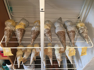
Messy paper mache

Drying on the rack until next class

Paper mache 
Paper Mache:
Into large mixing bowls, we mixed 1/2 cup of flour with 1/2 cup of water and whisked them tougher.
I had pre-cut rectangle strips of newsprint and brown packaging paper. (You could use newspaper, but I like the these papers because they are text-free, so are a more neutral base for painting over later. We began with our cone. We dipped out fingers in the paper mache and smeared it on our paper square. We placed this square on our cone and added more paper mache on top to seal it down smoothly onto our armature. We repeated this all over the cone, making sure not to leave any part of the armature uncovered. We also strove for a smooth, wrinkle-free finish. Then onto the scoops using the same technique, smoothing each square of paper as we go, and lathering over top of each piece of paper to seal and glue thoroughly.

That was that for day one.


Making strawberry and mango flavors


Day 2

Colors:
To save time and to cut down on paint waste, I pre-mixed a few flavors of ice-cream and the cone color. I knew the kids wanted strawberry, mint-chip, mango and chocolate, so I prepped these. We then made, lemon, raspberry, vanilla by just adding a bit more white to our mango, or a bit more red to our strawberry color.

Painting:
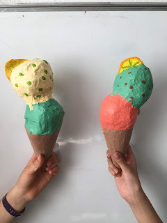
We began by painting the cone first. We dried with the blow dryer and then added some 'cone' texture in a darker brown. We used a plastic sheet with a gridded texture on it (saved from a food packaging) but you could use anything that has some kind of patterned texture. We just lightly dabbed this painted textured piece on our cone, all around, for a subtle texture.

Scoops were painted starting with the bottom scoop first. To achieve the dripping, melting look we took a blob of paint on our brush and placed it on the bottom edge of our scoop and coaxed it downward using gravity by gently tapping our cone on the table, allowing the blog of paint to drip every so slightly. Worked like a charm. Don't tap too hard or you'll damage your cone tip. Paint was applied thickly at the bottom of the scoops to get that creamy look.

The blow dryer was experiencing heavy use during this project. We needed to make sure each section of our ice-cream was dryish before painting the next section, to minimize smearing and colors mixing. Of course, some smudging was unavoidable. We took care to paint over any smudges, or wipe away unwanted smears. We strove for ice-creams that are clean and neat!
Regularly wiping our hands with baby wipes was one way we kept unwanted paint smudges and finger prints from messing up our cones.

Slices were painted in yellow or orange, and then with a fine brush we painted the rind and segments in a darker color. Some students used a Posca pen to draw the segments. Cherries were painted in red with a white light reflection spot.

This project was super fun and the kids just loved it! They all went home with beautiful, creamy, delicious ice-creams that demonstrated care, control and craftsmanship, with a little humor and quirkiness too.

Just perfect for an end-of year project!


Teacher sample close-up of dripping paint