
 |
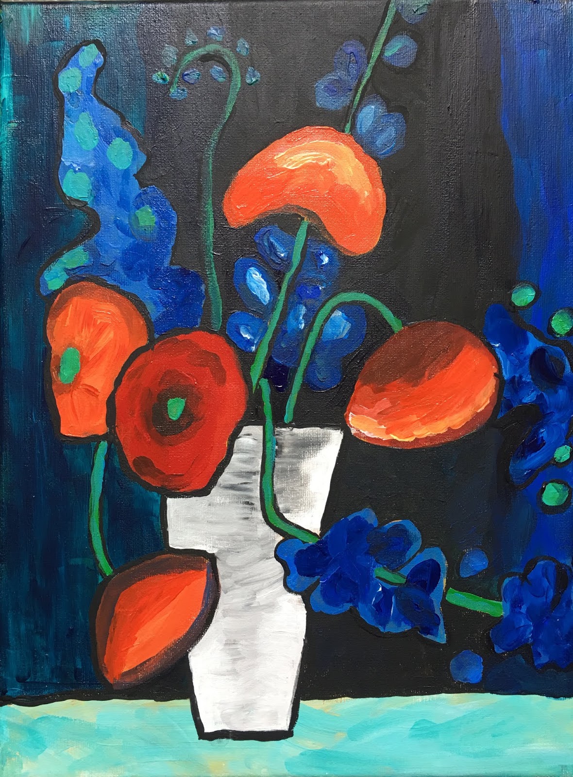
| Michel Keck |
 |
| Michel Keck |
A few approaches will help students experience success, and will lead to artwork that is rich, layered, exciting and interesting.
 |
| Kids aged 9-11 |
 |
| Kids aged 9-14 |
 |
| Day 1 Objectives |
DAY 1 and DAY 2
We looked at the work of Michel Keck, and noted her use of collage paper to reproduce the different values (lights and darks) in her dogs. To make her dogs look realistic, despite being made in collage, she often paints the eyes and nose. She also often adds a bold, whimsy contour around the edge of the dog, for contrast and emphasis.
Dog Trace and Transfer:
Students each chose a photo of a dog. I had printed many options for them, where the contrast of light to dark was strong. All white dogs, all black dogs, or yellow labs may not be the best option since this project, since it is about mapping out values. Dog photos were found on the internet and printed as large as possible on regular printer size paper. This will be the size students will collage on.
Googling 'Dog Portrait Photography' will give you some great photo options.
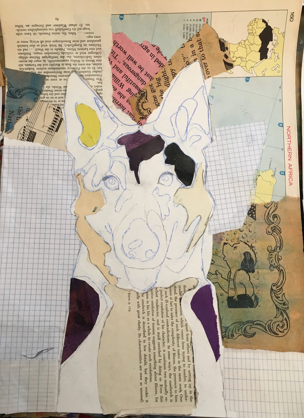
Using transfer paper, student transferred their dog onto their 20x30cm watercolor paper by tracing all the contour lines, eyes, nose, and the larger value 'shapes'.
 |
| Collaged background in neutral papers |
Background:
Students pasted neutral tones of collage papers all around the the space around their dog. For VARIETY, students must use different types of papers for this step.
At their disposal were: book papers in various fonts and stages of yellowing, newspaper, lined paper, grid paper, butcher paper, sheet music, dictionary paper, recycled paper with hand written notes, etc. Important is that the papers are all neutral tones. Papers were torn or cut in larger pieces, to quickly and spontaneously fill up the paper. The background will be painted over later, so this stage shouldn't require too much thought or time. Its purpose is to create texture and interest in our background.
* We used acrylic gel medium to paste, but mod podge would work too. The rule to gluing with gel medium is: 'glue under and glue over', much like you would with decoupage.
* We used acrylic gel medium to paste, but mod podge would work too. The rule to gluing with gel medium is: 'glue under and glue over', much like you would with decoupage.
Beginning Collage:
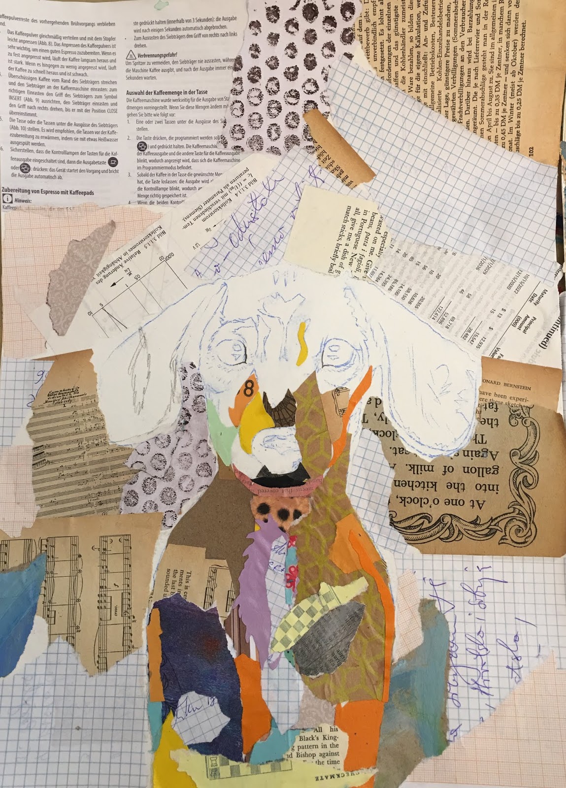
Student chose maximum 10 types of paper which roughly represent a value of 1-10, or lightest to darkest. Limiting their papers will result is a more BALANCED and HARMONIOUS end result. Student must repeat the use of each paper for this same reason. For VARIETY and interest, students were encouraged to use a range of papers, including patterned, plain, painted, map, cools and warms, and neutrals.
Tearing or cutting their papers, students begin pasting their collage papers on their dog, looking for good value matches. For example, perhaps a darker area under the chin and in the ears will be represented by a darker blue painted paper, while a lighter area in the chest and forehead will be represent by a lighter, patterned paper. A middle value might be represented by a plain pink color, etc. Important is that the value relations are roughly correct.
*Tip: It's easiest to collage larger value areas first, then address the smaller value areas by layering these over top the larger areas.
*Tip: Avoid straight paper edges or corners as this looks unnatural and inorganic. Tear these away.
*Eyes and nose are avoided (to be painted later), but carefully collaged around.
*Painted paper made the biggest different for this project. I paint my own papers, with leftover paint from our palettes after class. I paint papers in color families, or analogous schemes, to keep the colors in harmony. This way, my students can always reach for papers in the color family they need (reds, blues, greens, etc). We found that our painted paper really looked like fur, because of the brush strokes and because of the random streaks of color. It gave our dogs lots of dimension and interest.
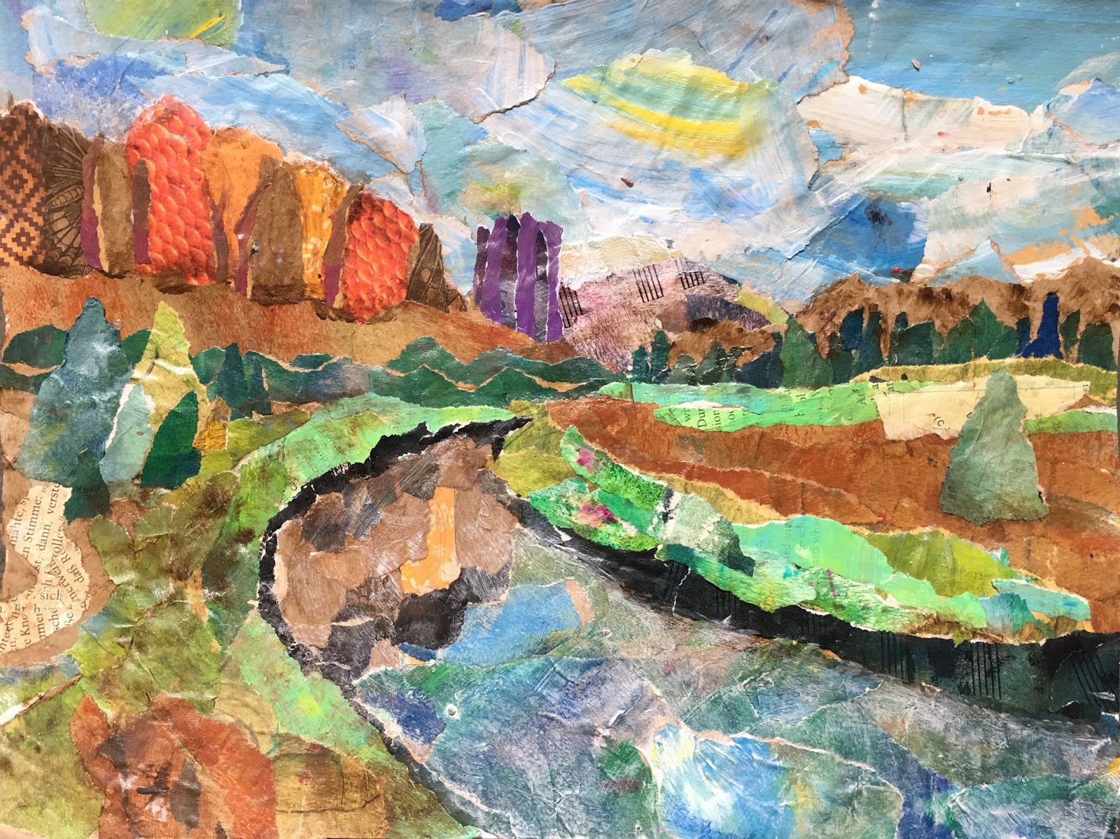
This is what our dogs looked like at the end of Day 1 and Day 2.


 |
| Day 3 Objectives |
DAY 3
Final Dog Touches:
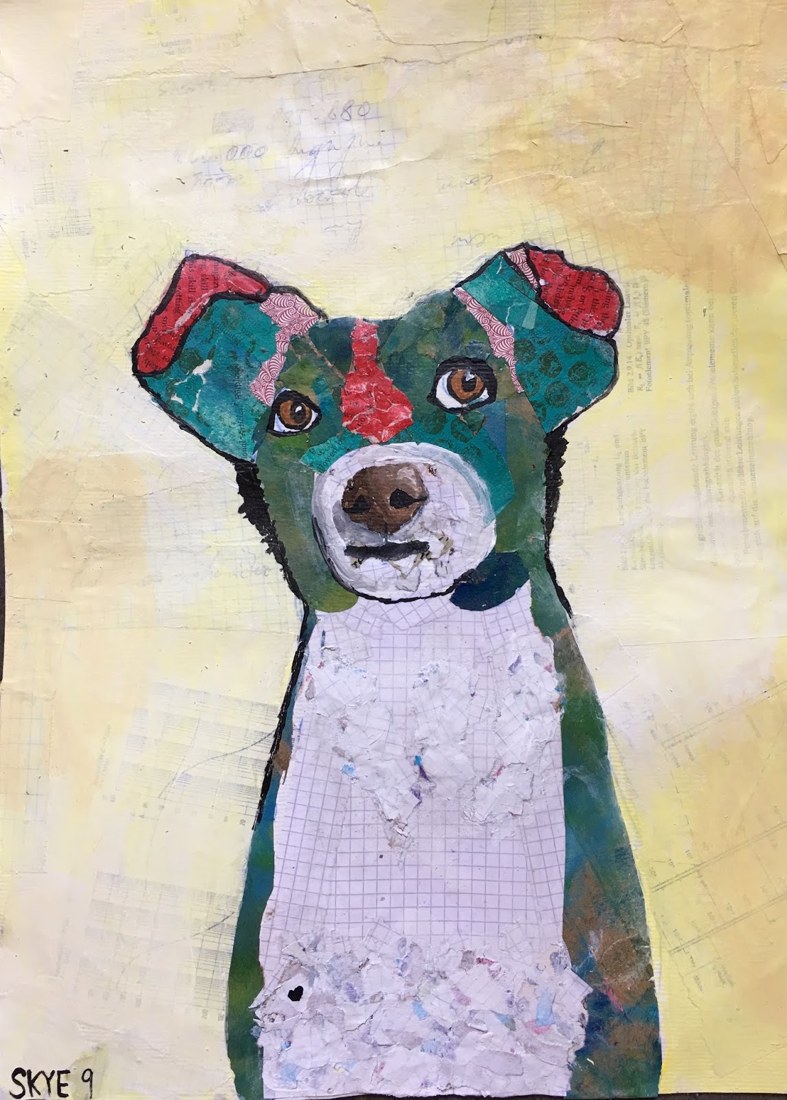
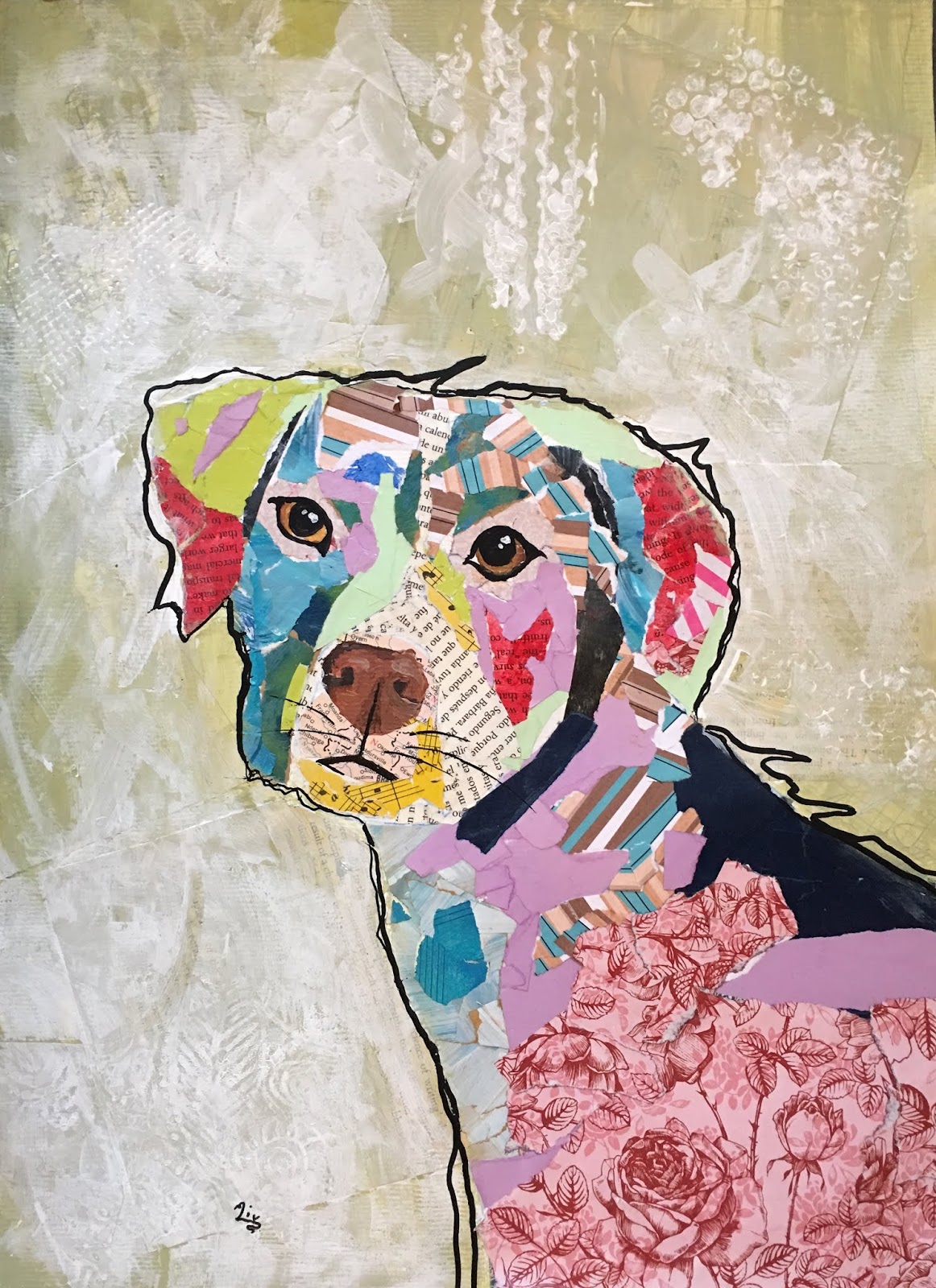
On our third day we painted the eyes and nose. We attempted to paint these as realistically as we could, looking closely at Michel's Keck's dogs for inspiration. I encouraged the students to be inspired by the painted eyes in Keck's wok, rather than trying to paint from our photograph, because Keck's painting style is somewhat reduced, yet still realistic, and easy for the kids to recreate. Noses were painted with attention to light and shadow, and all the values in-between.
Students could add a few minor black lines around the mouth area for emphasis.
Using a black posca pen (in thick and in thin line), students emphasized the contours of their dogs, with some whimsy squiggles and peaks to indicate fur, just like Keck does.
Background:
Students painted their background in layers of paint and stamps. They could either stick with a neutral palette, using white, grey, ochre, etc., or a color palette. Our goal was to still allow hints of our collage paper to peek through here and there, and to create lots of interest and texture. Our collage papers were painted over with a thinned color. We 'lifted' paint up by scrubbing or rubbing it up with rubbing alcohol (this reveals bits of our collage papers). We created subtle texture by stamping and printing using various stamping materials (bubble wrap, wine corks, corrugated cardboard...). **Important in this step is that a similar color is used, so the texture is subtle. For example, on a red background we might stamp with an orange-red color; on a gray background we might stamp with a lighter gray. We then add more paint in sheer coats, or dabbed some more color here and there, until we get a cloudy, soft, textured, rich look. Scrumbling or stippling the paint with our brush, or smearing paint around with our fingers, works here. As long as the end result is soft and does not overwhelm the dog (our main focus), it's all good. Once we found a good balance of texture, interest and color, we stopped and were done!
These results just floored me! The kids worked hard on these, but spreading the steps out over three 90 minute classes gave them plenty of time to bring it all together. I think they all loved the mixed-media and very tactile nature of this project.
I special shout out to my oldest student, Marko, 14, who asked if he could do a tiger. And what a great job he did!!


