|
| Teacher Sample |

Draw the sloth in pencil. Begin with very simple basic shapes: body shape (like an large kidney bean), then head (round, oval shape) with eyes and snout, then back legs (thicker at the thigh, thinner at the ankle, arms (thinner than the back legs), branch (curved and uneven, with knots and stubs), claws (three pointy long fingers that are wrapped around the top of the branch. Refine all shapes for more accuracy.
Draw several very large leaves which enter into the composition from at least three sides of the picture frame. Go for variety in shape and size. Leaves should both overlap and underlap the sloth to show depth.
Step 2: Crayon Contouring
Outline all the leaves, branch and the sloth in crayons. We used many greens, blues and yellows for the leaves, and added plenty of implied texture to the leaves indicating veins. We used many browns, black and white for the branch and sloth. Add fur texture to the body of the sloth using short dashed lines, and implied bark texture to the branch with short horizontal dashes. Be sure to use white in the sloth too, as this will show up nicely once the watercolor resists it. A ring of white or light pink can also go around the outside of the eye for contrast.
With a permanent black marker, color in the black part of the eyes and the eyeball (leave a reflection spot in the eye). This could also be done in black watercolor.
Step 3: Watercolor
Using many greens, blues and yellows, and mixing combinations of these colors, paint the leaves. Using different browns, paint the sloth and the branch. Think of light and shadows: The underside of the branch should be darker, and upper side lighter. The bottom of the body is darker than the top, inside of the legs are darker than the outer side, etc. The kids grasped this concept and rolled with it, and their sloths took on really good dimension. The face of the sloth is A very light brown or beige color.
Tip: Important is that watercolor is applied in light transparent layers, and darker values are slowly layered on.
Step 4: Background - Negative Space
With a small, round brush, paint the negative space in the background in opaque black. Students were very careful to paint along the contour edges of all leaves, sloth and branch, and made sure to fill up all the small spaces between leaves with a small detail brush where necessary. If the black was not dark enough after the first layer, add a second layer of extra opaque black paint for super strong contrast.
Optional: To fill up empty space in your composition, add additional simple details on top of the black with crayon where there is space (for example, thin twigs, long grass, etc.)
The kids were amazed by the magic of the crayon resisting the watercolor.
We took off the tape to reveal the crisp white border. My seven year olds LOVED this process, and were so proud of their results. One mom told me her daughter took her cherished painting to bed that night. Now that’s love!
 |
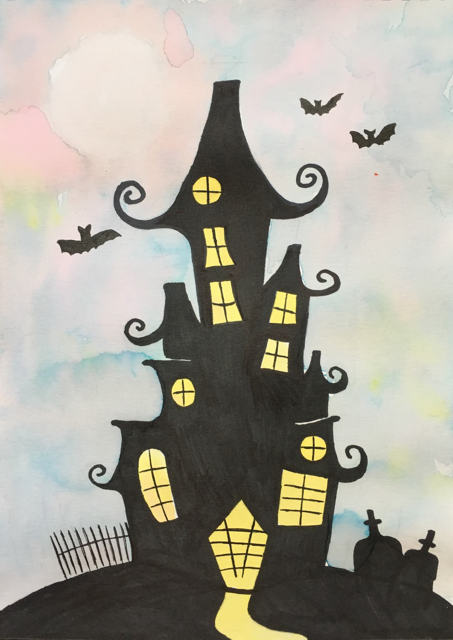
| Day 1 Progress |
 |
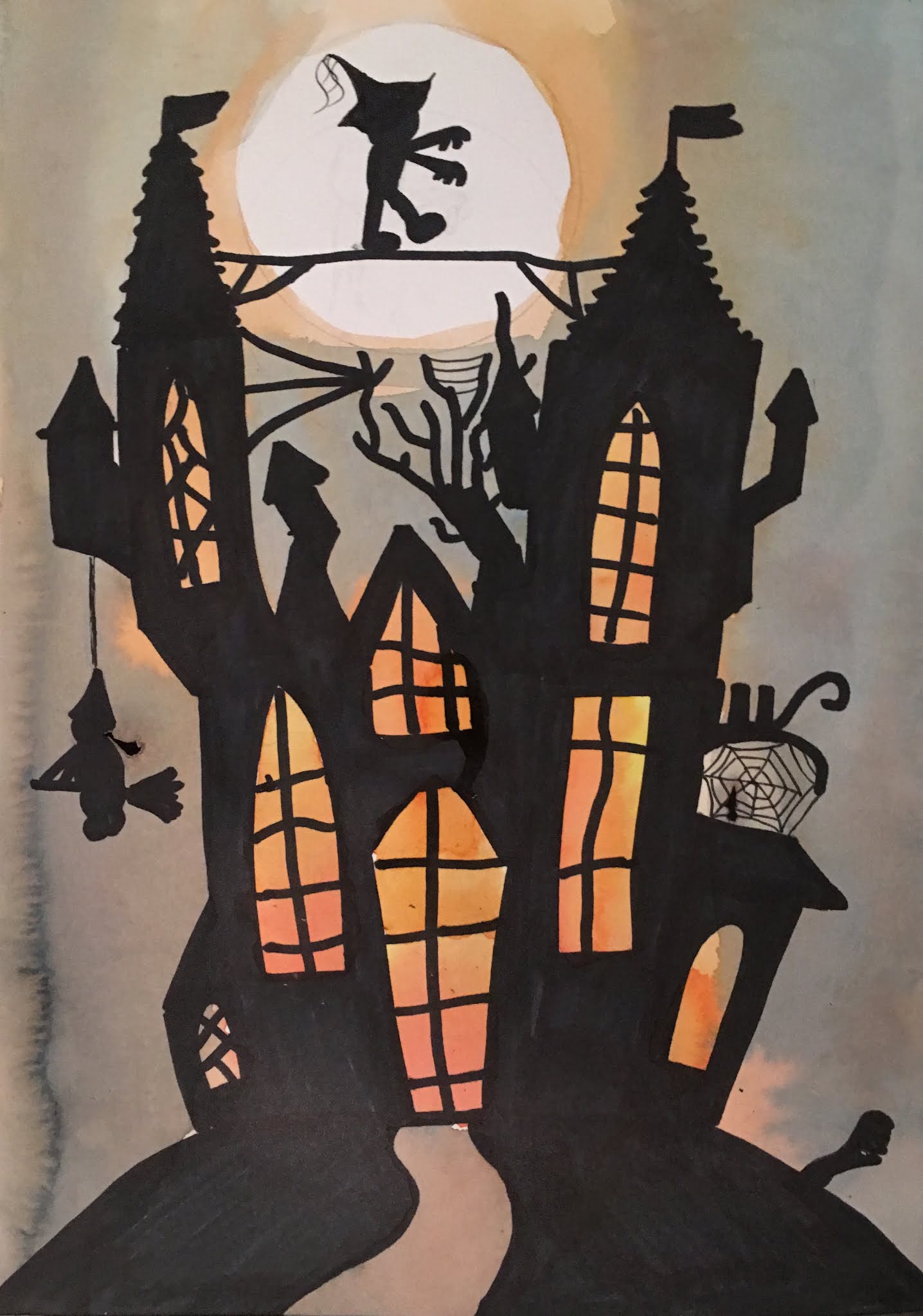
| Day 1 Progress |