Sunday, December 24, 2017

Christmas Tree Mixed-Media Collage

This was the final project for my little kids class (ages 6-7) before the winter break. It was a power lesson turned up to high speed! We did this beautiful project in under 90 minutes. 
It was a step by step process where I demonstrated each step, before the kids followed the step on their own. 

Process: Students collaged sheets of old book paper and sheet music paper onto multipurpose paper using an old brush and acrylic gel medium. We gave our collage paper a top coat of gel medium, and dried it using a blow dryer. Next we spritzed a few spritzes of blue-green paint on our paper which I had premixed and put in a spritz bottle, diluted with plenty of water to ensure it spritzes nicely. We dried this. Next, we used bubble wrap to stamp some white snow all over our paper (we applied white paint to our bubble wrap using a brush). We put these background papers aside.
On another paper, we drew a large triangle. We laid down strips of green patterned paper (which I had pre-cut) on our triangle, being sure to line up each strip with the next, or slightly overlap, so as not to leave any paper peeking through. We used gel medium to collage the strips, ensuring to put a layer of gel medium over top each strip too (under and over, is the rule for gel medium). We dried these, then cut out our triangle tree.
Next, we drew our very own star on yellow paper. Some of us practiced this a few times, before working on our yellow paper. We glued our tree on our collage background, then glued our star on top. Next, we make presents using squares and rectangles of patterned paper, and cut very thin strips of contrasting paper which we glued on top like ribbons. We glued these in a heap under our tree. 
We dried everything with a hair dryer. Using soft vine charcoal, we went along the edges of all our objects (tree, star, presents) and smudged with our fingers to give our art some depth and dimension. Lastly, we used a wooden stamp and stamped a few times around our paper. We also stamped in the date using a date stamp, so we never ever forget what day and year it was when our little creative hands made these beautiful christmas trees.


Visual Rhythm with Tea Pot Stencils and Watercolor Glazing

Student teapot stencils
Examples of visual rhythm in art and design


We know there is rhythm in music. In this project we learned there is also rhythm in art: visual rhythm. This principle of art is achieved when elements of art (line, color, texture, shape) are repeated. We often see visual rhythm in surface design (fabric, wallpaper, wrapping paper, etc.). We looked at several examples of visual rhythm and examined how they give us the sense that the shapes are dancing and moving, and how the careful placement of art element makes our eyes to dance around the paper and causes our brains to anticipate the recurrence of these elements.
In week one, we each developed unique stencils of tea or coffee pots. This exercised our observational drawing skills, because we had to copy a tea pot from a selection of visuals I had provided. We were only interested in drawing the contour lines of the pot (no details). The tricky part was drawing the EXACT same pot in two different sizes, one large, and one small. These were then traced onto card stock and cut out. I helped the younger kids cut out the inside of the handle using a razor knife. We then traced them carefully and rhythmically around our paper, overlapping large and small. I had the kids trace their large stencil and few times first, making sure to leave enough space for their small stencil, which they traced afterwards. They we encouraged to make their stencils go off all four sides of their paper, to give us that fully enveloped view, like we see in wrapping paper or wall paper. We then traced our pencil lines using permanent marker and then erased our pencil lines. That was that for day one.


Traced teapot stencils, before color was added

In the next class we added color! I quickly showed the kids how to glaze using watercolor, and they did a small practice round, glazing primary colors, and glazing analogous colors. The most important thing about glazing is that the bottom color has to be completely dry before the second color can be painted over top. If it's not dry, the colors will physically mix as opposed to optically mix, which is not glazing at all. We know that glazing is an OPTICAL mixing of colors.
We experimented with the do's and don't of glazing using strips of scrap watercolor paper.
Glazing primary colors results in secondary colors; glazing warm colors results in analogous warm colors. We chose which color scheme we wanted to work with, and we began painting. Some students opted to add gradual changes in value in their pots, and other experimented with wet-on-wet applications in their pots.
Our backgrounds were done in a light wash of black with lots of water to make a gray for those who used primary colors, and a mix of blues and greens for those using a analogous warm colors. We used a wet-on-wet technique for our backgrounds, to get that beautiful, blended look. 
Beautiful design work!
Ella, 9


7-13 year olds

7-9 year olds


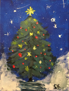
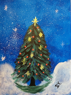
Christmas Tree in Acrylic Techniques


This was the final art project before winter break for our 7-13 year olds. To make it extra special, each student was given a 20x30 stretched canvas! They were pretty excited about this.

Inspiration for this fun project came from The Art Sherpa on youtube. The video lesson can be found here.

This was a teacher-led, step by step process. I demonstrated and explained each step in detail, and students then followed. What I love about this project, other than the festive aspect, is the many different acrylic painting techniques that are built into it.

Process: 
We began by using foam rollers to spread an even tone of blue paint on our canvas. Then we used a tooth brush to splatter a starry night into our sky. Next, we used a dauber brush to swirl in light and airy powdery-looking snow. We dried the canvas before moving on to the next steps.
We painted in our tree trunk to a few inches from the top of our canvas using the edge of a flat brush. Using a # 4 or 6 round brush, we brushed in strokes of dark black-green branches, getting wider as we went down (leaving an inch of trunk). Then we did the same thing, but used a lighter green/blue color (by adding some blue and white to our already black and green brush), and leaving lots of dark under branches showing. This gives us that depth we are looking for. Using our flat brush again, we added a few horizontal strokes of shadow under the tree. We then used a tiny detail brush (number 0 or 1) to paint in some glimmering stars in the sky. With the same brush we added the large star on the top of the tree, and several smaller sparkling stars in the tree. Using a Q-tip we added red christmas tree balls. Once dry, we used our tiny detail brush to added white highlights to our red balls, as well as to all our stars. This makes everything instantly glimmer and glow. 

These are fun and festive, and we exercised so many techniques and tools in the process. Best of all: since they are on stretched canvas, they can be instantly hung up on our walls at home to add to our festive holiday decor.

Happy holidays!

Teacher Sample


Thursday, December 21, 2017

Karel Appel-inspired Avant-Garde Imaginative Creatures

Karel Appel
Karel Appel
Karel Appel


We took a look at Dutch COBRA painter Karel Appel (1922-2006). Some of our students referred to him as "Caramel Apple". Ha ha. 

Appel's abstract animals and figures are bright, childish, expressive and most importantly, happy. Appel painted during the dark and depressing war and post-war era in Holland, and was therefore determined to bring joy and color to the world through his art. His colors are bold and fine-tuned with the careful placement of black and white. His subjects are animated and delightful. 

We discussed Appel's use of color, form and shape. We began by taping our paper edges with artist tape, to give us that clean border when done, just like Appel. Then we drew our own imaginative, creative, fun, abstract figures. Using tempera paints and gauche we are using pure, bright colors to create strong contrasts. When painting was complete, we outlined our figures with a strong black line using a small brush.

We had so much fun with this project! Some of us decided to create abstracted animals (cows, cats, dogs, hippos) while others created truly invented creatures. Either way, our creativity was flowing freely, which juxtaposed nicely with the need to think critically about the placement of color, line and shape.


Karel Appel in process


Romero Britto Fractured Pop Art


These are gorgeous works of happy, positive-thinking pop-art! Romero Britto (Brazil-born in 1963, Miami-bred) was all about conveying the best sides of life in his bold, colorful (sometimes kitschy) work. 

My students (ages 6-11) completely (and effortlessly) grasped the intentions, the style and the elements behind Britto's work. It's hard not to. His work really strikes a cord, and my kids were all totally smitten with his style. 

Themes like careful patterns, bold colors, clean lines which connect our subject with our background are so very pop-art! Fractured compositions which blend and connect subject and background remind us of Picasso and cubism. 

After analyzing Britto's art we got right to work and chose our own Britto subject to draw. We added our own unique patterns and designs. We left a few "key spots" white to accentuate our main subject (emphasis) amid an otherwise busy and colorful composition. We carefully considered balance and variety of color, pattern and shapes. In the coloring process, we recalled the marker techniques we learned last semester: layering dark over light, coloring small areas in short, tight strokes to minimise that streaky look, and using wider markers for large areas, and thinner marker for smaller areas. 

We used Canson marker paper for this project. I've learned that using marker paper for marker projects makes such a big different, and is a much better experience for students. Colors glide on easily and smoothly to the smooth surface, making the coloring process more effective and efficient. The paper is thin but the markers do not get soaked into or absorbed deeply into the paper, which makes the paper less prone to tearing, and results in super vibrant, glowing colors. Well worth the investment!


Romero Britto