Sunday, April 29, 2018

Oversized Cat and Dog Mixed-Media Collages

I've been wanting to do this project for ages, ever since I saw it on the blog Elementaryartfun@blogspot.com.

You can find Natalie's original post here.

After many illustration and painting projects under our belt, I wanted to do a paper art project with my kids, and knew this one would be perfect for all ages. And boy, was it fun!

Be aware that this project is rather time-consuming, as it requires many steps and is done on a large format. It took us three 90-minute classes, but it worked out well, since we lumped the three main steps into one class each.

Day 1:

Students chose to do either a cat or a dog (large or small breed). I prepared tracers of cat eyes, dog eyes, cat nose, and a small and large dog nose. I used simple cardstock for this. I don't usually use tracers, but felt they were fitting for this projects since the focus was really on pastel blending, painting for dimension and definition, and collaging, and the tracers really saved us a lot of time and effort in an already lengthy, multi-step project.


Students traced their eyes and nose on good watercolor or acrylic paper. Eyes were colored using 3-4 analogous oil pastel colors. Starting at the outer edge of eye ball with the darkest color, students colored a ring of color always coloring in the direction of the pupil. The next lightest color was applied in the same way, but slightly touching the first ring of color in order to have the two colors blend. The third and fourth colors was applied in this same way. This process created slightly blended colors where one color ring transforms into the next, and it really looks like the streaks of iris color.

You're best off watching Natalie's eye coloring tutorial here.

Once irises were colored, black acrylic paint was used to color in pupils and the outer edge of eyes. Reflection spots were added in white acrylic paint.
The dog nose was painted using black acrylic paint with white, to create grays. Cat noses were painted with red with white, to create pink. Highlight spots were added here too.

Watch Natalie's nose painting tutorial here.

This was all we managed for day 1.


Day 2:
To hugely save on time and cut down on mess and waste, I had prepared and pre-torn strips of paper is various colors, patterns and textures. I used as many different kinds of paper as possible for maximum interest - atlas paper, book paper, painted paper, printed/stamped paper, deco paper, wrapping paper, graph paper, dotted paper, colored construction paper.... and I had my (biological) kids help me create paper using different mediums (watercolor resist, printing with stamps, painting with stencils, scribbling and drawing, printing with bubble wrap and other found objects, etc). I then tore these up into long strips. You could do this step on a separate day with your students (the kids would love it) but I was pressed for time.

So, day 2, students were given a large 50x35cm black paper and were told to collage strips of paper in as many different colors and patterns as possible (mindful of balance and harmony, so perhaps repeating a few colors and patterns here and there). Strips should head towards the center and go slightly beyond the edge of the paper. We used acrylic gel medium for our glue. As always with gel medium, we glued under and over, which really helps to firmly seal our strips.
This process took nearly the full 90 minutes of class.
Collaged strips


Day 3:
We glued our eyes and nose onto our collage paper. We had many visuals of dogs and cats at our desks, to helps us visualize the facial order, features, texture and fur of our animals. We noted that with animals (and people), eyes are generally placed only as wide apart as the width of our noses. We glued these down and went over them with glossy acyclic gel medium, which gives our eyes and nose that glossy shimmer.

Then it was time for adding definition, dimension and texture, and to make our eyes and nose harmonize with and look like they 'belong' to our collaged background. Using only black and white paint (and creating our own grays), we defined our eyes, created a snout shape and chin, considered dimension and facial structure. Again, we looked to visuals of cats and different dog breeds for inspiration. Cheeks, chins and snouts were pushed forward in that we used more white and light grays here, while eyes were pushed back in that we added more black around the edges. Using feather brushes and other fur-rendering paint brushes (fan brush, wisp brush), we added furry lines and texture around eyes, forehead, along the edges of our snouts, and anywhere we wanted that furry look.

To make the eyes less 'startled' and to give our eyes more character, we painted over the upper edge of the iris. This softened the look a bit. We even abandoned brushes and used our fingers to finger paint some definition here and there. Fun!

All my ages groups, from age 6-14, really enjoyed this multi-step process.... perhaps without even realizing just how much learning was happening!  A real winner of a project!

Thanks again to Natalie from Elementaryartfun.blogspot.com for the awesome inspiration!


Ages 8-11


Ages 8-14

Ages 6-7

Tuesday, April 17, 2018

Breaching Orcas

This was a multi-step project with tons of learning opportunities, and it was just plain fun to see all the elements come together to create a very dynamic (and realistic) breaching orca scene.

Day 1: Drawing and painting the orca

We drew our orcas individually and purely by observation. Students each has an orca print-out at their desk to choose from and to be inspired by. We were careful to make sure our measurements were correct, to get the right shape and proportion. Getting just the right back arch on our orca was key. 

We then painted our orca with black and white acrylic and created our own grey for shadowing on the white areas, and for adding highlights to the black areas. This gave our orca dimension and shape. 

Painting orcas
Painting orcas

Day 1: orcas

Day 2: Creating the mixed-media backgrounds; pasting our orca; finishing touches

We drew a horizon line in the middle of our paper and painted our background in two sections: sky and sea. 

We discussed atmospheric perspective and noted that the sky is darker towards the top and lighter towards the bottom. Mountains are uneven and have a shady side and a highlighted side. We mixed our own colors, blended and gradated our layers of sky and sea from dark to light. We gave highlights and shadows to our mountains. We used several different brushes and a palette knife to achieve our results. Using a palette knife on the mountains helped us get that scraggly rocky look. 
We discussed that clouds are randomly shaped, airy and fluffy, and we blended them softly into the sky for a softer, more distant look. 

We cut out our orca from last week and pasted it on our ocean scene. Our last step was to add some splashes of water where the orca is coming out of the water. We did this with a dry synthetic brush and white paint, and gently stippled the paint around the tail of our orca. We were careful not to overdo this step.

This is quite a sophisticated project. The results are atmospheric, detailed and rich. I'm so proud of these!

This project, in all it's rich details, was inspired by the excellent painting tutorial of Wilson Bickford. You can view his tutorial here.


Ages 6-10
Ages 7-13


Friday, April 13, 2018

Paul Klee Tunisian Landscapes

All my age groups got to know one of my favorite artists of all time, the Swiss-German expressionist, abstract artist and Bauhaus teacher, Paul Klee. 


Klee completed over 9000 works of art in in short 40-year lifetime, mostly drawings and watercolors. Most are small format, drawn on paper, though Klee loved to explore working on other surfaces, such as cardboard and gessoed canvas. His work is defined as child-like, musical, expressive, fantastical, symbolic and cubist, among other things. Landscapes in blocks of carefully balanced colors, filled with a symbolic language are Klee classics - and the inspiration for this project. 


Klee loved the atmosphere, architecture and colors of North Africa and made many trips to Tunisia during his lifetime. These lengthy sojourns inspired him to produce hundreds of renditions of his geometric, color-blocked, earthy Tunisian landscapes. 

My 7-13 year olds analyzed a dozen of his works, deconstructing his use of line, shape, color and symbolism. 

He loved to use watercolor in its most ethereal form - with tons of water for that beautiful transparent wash, and for layering and glazing.

For this project, I precut small pieces of canvas and primed each piece with white gesso (like Klee).

Using watercolor is transparent washes using 'dirty colors', we began our blocky landscape using geometric shapes and earthy tones. Dirty colors are the ones that build up on the mixing palette side of the watercolor tray - just reactivate these with a moist brush and you've got the most gorgeous earthy tones. Add a hint of a clean color to liven up the muddy colors and bit, and you've got Klee's Tunisian landscape colors - earthy reds, warm oranges, brown-greens, etc. A watercolor wash simply means more water, less pigment. Painting this way allows the bright white canvas (or paper) to shine through, and makes for a soft, ethereal result.

We then analyzed his paintings for drawings of city dwellings, villages and desert life, and then drew our own fantastical layered city, connected by stairs and ladders, using fine-liner permanent marker.
The iconic Klee sun and symbolism was also incorporated. I had handouts of examples of Klee's symbols to help inspire. 

To create the soft, hazy looking sun, we took a wet brush and scrubbed the under paint away inside our sun. This rewet the paint and allowed us to then lift it up with a tissue, which revealed the white gesso underneath, and voila, we had a white sun. 

I also showed the kids how to lift watercolor up using a dry brush. The dry brush soaks up excess water, and pulls up the paint. A great little trick for achieving and controlling transparency. 

Lastly, like Klee, we mounted our canvas on colored paper, and then mounted that on cardboard, giving us two borders. 


Ages 6-9
Ages 7-12


Close-up, age 10
Close-up, age 7


Wednesday, April 11, 2018

Robert and Sonia Delaunay Concentric Circles

For this project we were all about circles. Well, it's a little more complicated than that. 

Sonia Delaunay

Robert Delaunay


My 6-12 year olds looked at the work of Sonia and Robert Delaunay, (1885-1979) and (1885-1941). They were part of the bumping modern art scene in Paris at the turn of last century. They experimented with cubism and fauvism before founding the movement called 'orphism', which is all about rhythmic shapes and the interaction between colors and the relationships they create, particularly that between high contrasting colors. 

So, after analyzing some of Sonia and Robert's work, we set off on our color and shape journey. 

Day 1: 

Drawing process
Using round templates of various sizes we drew many concentric circles. When drawing our circles, shapes and lines, we were aware of balance, variety, rhythm and unity: big and small, thick and thin, high and low, horizontal and vertical, whole and half, etc. 

Coloring process
After drawing our compositions we began to color with oil pastels. We are only using primary, secondary and achromatic colors (black, white, gray) and are paying special attention to placing colors next to each other which create high contrast, such as complimentary colors, bright and dull, dark and light, and warm next to cool colors.


Day 2:
Serious color theory and composition was at work on our second day. We were going for high contrast, like Delaunay and the Orphism movement did, so lights and darks next to each other, cools next to warms, pure colors next to tints or shades, black next to pure colors, complimentary colors next to complimentary colors, etc. The kids regularly checked in with the color wheel, as well as Sonia Delaunay's work during the coloring process. They kids' hand were HURTING, as our objective was to use the oil pastels to get super creamy results...so we pushed on! 

After filling all our shapes with oil pastel, we painted over each shape with a brush and olive oil. This gave our oil pastels a painterly, inky feel. You could use a gloss medium too, but why not use up that old olive oil you're not crazy about? And it's a fun twist!


7-12 year olds

6-9 year olds


5-6 year olds. Watercolor and black oil pastel.

Monday, April 9, 2018

Tiger Head Observational Drawing

Drawing our tiger. Observing details.


One of the first projects I EVER did with my 6-11 year olds, after opening the 'Art Room', was this very fun tiger head project. Objective here was for the kids to exercise their observation skills, and for them to follow line instructions as I demonstrated a guided drawing of a tiger on the board. Listening, observing, connecting art elements with art vocabulary... and then creating on their own.... all critical skills when starting out in a new art class.  It also helped me gage where my new students were at in their art experience and it was actually a pretty simple project with clear guidelines that delivered success (and pride) to all.

Tiger Heads. 6-11 year olds

We began by closely examining tiger photographs, and describing the various elements of his features (color, texture, shape, line...). I did a guided drawing on the white board and kids followed along. I showed them step-by-step how all the features lined up with one another proportionally (as they do), for example, nose is between the width of inner eyes; mouth is as wide of as the total width of both eyes, outer eye to outer eye; rounded ears are spaced evenly right above each eye; eye balls are slightly hidden at the top by the eyelid. etc etc. Most of these measurements are true for all animals, including humans, so it's a valuable lesson in face proportion drawing and symmetry.

Next, students then examined their tiger photograph and added the various black lines and patterns, whiskers, fur and other details on their own. Then, these were colored in using colored pencil in black, tiger in orange, and the fur was done with very light pencil shading with white colored pencil over top to smudge and smear the pencil shadings to a natural-looking slightly greying shade.

Additional colors were added as desired (eyes, nose, inside of ears). As always, I stressed the importance of adding a reflection spot (light catcher) in the eye, and using more than one color in the eye for a more natural looking iris.

Backgrounds were done in a very light application of chalk and smeared with fingers.
These kids were very proud, and dare I say, some were amazed by their results!


Hazel 7

Sif 6

Vita 9

Madalena 10

Adela 8

Marko 11

Michat 10

Matylda 7

Ned 8

Oliver 6

Koh 6

Ottilie 8

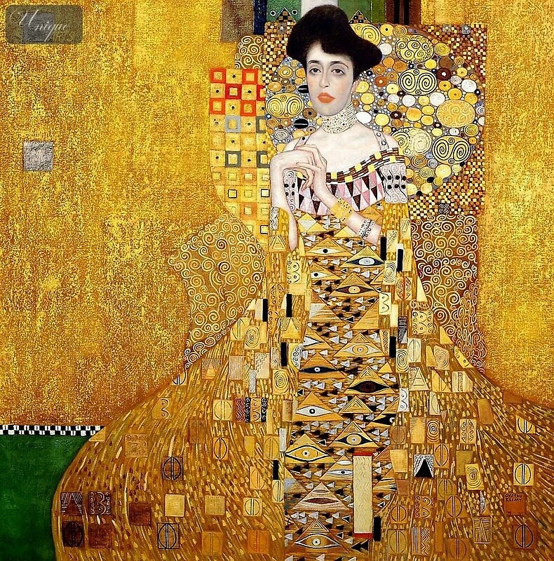
Gustav Klimt Portait of Adele (Woman in Gold)


Image result for adele bloch bauer
Portrait of Adele Bloch Bauer ('The Woman in Gold), Gustav Klimt 1907

This was one of my favorite projects from a few years back, and my student still talk about it. Apparently, they loved it too, and that's not surprising, because we used fun techniques and mediums to make these glimmering beauties come to life. All my age groups, (4-6, 6-12, and adult) did a variation of this project.

Gustav Klimt's portrait of Adele Bloch-Bauer, also called "The Woman in Gold" was our inspiration for this project. We looked at Kilmt's use of design, pattern and color, and in creating our own Woman in Gold, we were mindful of balancing our use of line and shape. We repeated colors and patterns (red- yellow, red-yellow etc) for balance and cohesion. 

To begin, we primed a large piece of cardstock (you could use cardboard, acrylic paper or watercolor paper) with gold acrylic paint, to which we added a hint of brown for a more rustic effect. We set this aside.

Using a colored print-out with Adele's face and arms, which you can find over at Art Projects for Kids, (see link here) we added our very own Klimt-esque decoratively draped gown and 1920's style hairdo, with plenty of decorative patterns, motifs and designs using black permanent marker. We referenced many Byzantine and Art Nouveau patterns (zentangles would work too) to help us along. I emphased that patterns should be done neatly, with line points connecting, and should exhibit variety in density and style. We then colored these patterns in with marker. I stressed the importance of working in sections using patterns of color, or color schemes, to keep things unified and harmonious.

Klimt belongs to the Art Nouveau, or in German 'Jugendstil', era which is classified by its ornate, decorative and detailed elements. Inspired by Byzantine art, Klimt used lots of metallic paints and gold leaf to add shine and shimmer to his beautifully complex work. We too, added finishing touches to our patterned robes using metallic markers and paint pens. The kids were all ooh and ahh over the metallic markers.

Once Adele was complete, we cut her out and laid her on our gold-painted background --- without pasting yet... because first we added more cut outs of patterned deco paper and pasted these under Adele, to extend her headdress, her gown, and to embellish the background behind her. Finally, we mounted our Adele on our background and added some bold black lines for definition and to connect all our elements. 

Beautiful. The kids were all so proud of this one!


Adele in progress, above.
4-6 year olds: work in progress
4-6 year olds, with original 'Adele' top left
Ages 7-11
Ages 6-9

Link to Art Project for Kids 'Adele' template: