Wednesday, November 28, 2018

Indian Corn Pen and Watercolor Illustrations


Teacher Sample
Fall is so much about color and a bountiful harvest. Indian corn is both of these things. I'm fascinated by the colors, the glossy kernels and the wild, papery husks and knew this would be a wonderful theme for an art project. I explored and experimented with a few mediums and approaches (like close-up kernels and coloring with marker) and eventually settled on watercolor and pen. This project focusses on observational line drawing, watercolor and pen techniques, and color. 

Process

Day 1
Students become familiar with Indian corn. We look at many pictures, illustrations, and paintings of Indian corn, in all it's colorful and diverse glory. Students are presented with the objectives for our project: 
  • Draw 2-3 corn cobbs with husks
  • Overlap corns and husks (think about composition - husks should be various sizes, shapes and go off in different directions
  • Draw corn kernels (not too small, and no more than 4-5 vertical rows)
  • Shade with pen using hatching, cross-hatching and stippling

Objectives and demo
Kernel drawing demo

Drawing:
I demonstrated on the board how I might draw a corn cobb (not too fat, not too thin, a bit wider at top and narrower and rounded at bottom. Then I underlap two behind the first in a visually pleasing manner. Husks are trickier. We looked at husk pictures and the actual husks I brought to class. We noted the papery texture and the many bends and crinkles. I demo'd how husks grow up and out of each corn cobb and go every which way. Some are wide, others thinner, some longer, others shorter, some bend forward or backward, many overlap each other. Students draw out their compositions. Some students had to be encouraged to draw their corns larger, or to add more husks.

Kernels:
Kernels look tricky but are actually quite easy. I demo'd how to draw 4-5 vertical rows down the front of our corn, and how to fill each row with plump kernels. Kernels should very in shape and size a bit, so as not to end up with a super 'perfect' row, which would look unnatural. Kernels should be plump, and a bit disc-shaped, and should touch up against each other. There should not be any space between kernels. When the lines of our kernels meet up against each other, it creates a darker line, which in the end will create the illusion of depth. Kernels at the very bottom get smaller, and might even look like little balls. Kernels on the outer vertical rows of our corn might be a bit smaller too, because they are curving back in space, so we only see a portion of them. The rows in front are larger. This creates a 3-D look. Students were surprised at how much dimension their corns had. Once everything was drawn, we traced our pencil lines with permanent black fine liner marker and erased our pencil lines. As always, we used various widths of marker - larger for main contours, and smaller for details and shading.

Shading:
Students used hatching, cross-hatching and stippling to add shading, texture and detail to their corns and husks. As a rule of thumb, I tell the kids that any place that is overlapped or right up against another place will have a shadow, so make some marks there!
Some students chose to stipple or color in a few of their corn kernels, since Indian corn is often randomly dotted with very dark kernels.

This was what we managed on day 1 (90 minutes)
Day 1 illustrations, little class (7-8)
Day 1 illustrations 8-10 years
Day 1 illustrations 8-14 years
Day 2
As always with watercolor, we start with very light washes of color, and slowly build up more color intensity. Students decided which colors their corn would have. I suggested warm colors, cool colors and rainbows colors. To keep colors a bit less bright, and more autumnal, we mixed in some browns and ochres and ultramarines in with our colors. Basically, I encouraged students to not be afraid of using the 'dirty' side of their palette when mixing their colors, and to allow for some unexpected colors to mix. Toning colors down will give us a more realistic Indian corn feel.
Corn were painted in their choice of colors. Our painting technique was less 'painting with brush strokes', and more 'dotting or dabbing' our brush around our corn, randomly dotting a light wash of color here and there. Then another color was 'dabbed' around our corn here and then, and then another, unill our corn had a few different colors. Because we used lots of water on our brush and a light wash of color, these colors subtly bleed into each other creating a soft but colorfully subtle under-layer. Once a bit dry, we went back into our corns and dabbed again, this time with a more intense color (less water, more pigment) and dabbed just a few kernels here and there with this color, then a second color and a third. Students were encourage to not paint each kernel, rather, just a few. The more intense the color, the more dimension and interest our corn gets.

Husks were painted in a similar manner. The super light wash of our lightest color first (a grayish, neutral yellow or ochre). This color was dabbed around with a very wet brush anywhere where our husks are catching the most light. Our color must be transparent! Then we did this again with a second color, a bit darker (more intense grey, darker brown mixed with ultramarine) but focussed on areas that are slightly in shadow or shaded, or where areas overlap. And again with our third, darkest color, we dabbed color anywhere where we have more intense hatching, cross hatching or stippling. Since we already shaded with pen, it was easy for the kids to see where their darker paint should go. Each application of paint should be somewhat transparent, to ensure we can still see the beautiful pen illustration underneath, and to impart lots of light and dimension (the beauty of watercolor).

Backgrounds were done wet on wet, also with a very wet brush and super light wash of color. Again, brushwork involved dabbing and slightly pushing color around, rather than streaking color with brush strokes. This gives us a more cloudy, foggy, softer look, and prevents that streaky appearance.

My kids of all ages (from 7-14) and my adults were all wowed by their results.

Petra, adult

Lisa, adult
Anuradha, adult


Rune 7

Phoebe 10


Vita 12
Daniel 8
Dasheng 10
Sif 10


Adult class

Adult class

Little class (6-7 year old)

Kids 8-14

Kids 8-10


Tuesday, November 27, 2018

Wayne Thiebaud Oil Pastel Cakes

Wayne Thiebaud, how cool is he!? Cakes and desserts were his thing, and thick, impasto oil paint was his medium. 

My 6-12 year olds took on his cakes with these colorful, creamy oil pastel versions.
The operative goals were oil pastel techniques (blending, layering, thick application of our medium); form and dimension (highlights and shadows, drawing ellipses); and perspective (parallel lines). For a richer finished product, we drew on colored paper, which gives our art an additional back glow and a certain 'je ne sais quoi'. I think of using colored paper as our drawing surface as an underpainting to our painting. A must.

A pretty simple and effective project. Students practice drawing ellipses. For a cake, draw two identical ellipses, one above the other, and connect these with two lines (left and right). Voila, there's your cake. For the cut out piece, draw an upside down 'V' outwards from the center. This is the 'V' of the top of the cut out slice. For the 'V' of the bottom of the cut out slice, draw another upside down 'V' from the bottom half of the cake and ensure that the lines of the top and bottom 'V' are parallel. Connect the two Vs by drawing a vertical line down the front from the center point of one V to the center point of the other V. Done.
The plate that the cake sits on is yet another ellipse. The horizon line is drawn in.

Coloring
Students color their cake with a strong slight-to-the right light source in mind. Highlights are created by adding white over top of our main color, while shadows are created by adding a similar but darker color over top of our main color. These are blended with finger or with the oil pastels themselves until smooth and creamy. The inside of the cut out slice also has a highlight and shadow. Since the light source is slightly to the right, the slice section on the left has a bit of a highlight (part of which is cut off from the section of the cut out slice opposite it, while this opposite side is in shadow. Plate shadows are done in blue or purple.

Super fun. Kids were very proud and feeling hungry.


Mixed Media Batik Autumn Vegetable Patch

These batik fall veggies were done in 2018 by my 6-11 year olds, and my 4-5 year olds, a few years back using oil pastel. I did this project again recently with a group of 7-8 year olds and tried a different medium - crayon. Both oil pastel and crayon work really well for this process.

Process

Draw:
Kids draw 3-4 fall veggies (gourds, pumpkins, corn, squash). They draw by observation from photos and real veggies. Each veggie is drawn separately on medium weight mixed-media paper. Printer paper will be too thin, as the paper will get quite wet and worn in this process. Lines are drawn vertically down the veg, following the shape of the veg in order to create a sense of form. Then lines are drawn horizontally, also following the form of the veg (so for a pumpkin, lines would be slightly curved because the pumpkin is round). You will end up with a veg that is checkered. Main contour lines (corn husks, outer lines, segment sections of pumpkins) may be traced in black permanent marker, which creates more contrast later, but this step is optional.

Color:
Each checkered box is then thoroughly filled with fall colors in oil pastel. Colors should be repeated throughout the veg in different areas for good balance and harmony. The best way to do this is to start with one color, red for example, and color a few red squares in your first veg by bouncing around to all sides (top, bottom, middle, etc ), then take your next color (orange for example) and color a few squares orange. Then follow the same approach with yellow, green, pink, etc....until your veg is filled with color and your colors are distributed in a balance way.

Batik:
Counter-intuition can be a frightening and thrilling thing. Student are asked to crumple their veggies as tightly as they can, like making a ball out of paper, careful not to tear or twist it. Some students were nervous about this, but they jumped in anyway. 
Papers are opened up again and laid flat. Students can even step on their crumpled paper for more pressure - they love this! Then, with a flat brush and very opaque black watercolor, students paint over their veggies. The black paint resists the oil pastel, but seeps into the white paper that is created by the folds from the crumpling. The watercolor may be wiped away with a moist towel, or even run for a second under a sprinkle of water at the sink. The veggies take on a batik look. These are laid aside.

Background:
Students trace a few fall leaves with a pencil on regular printer paper. We used real fresh leaves, but you could use tracers. For visual rhythm and more visual interest, leaves should face in different directions and be different sizes. These are then colored in cool colors with watercolor. The negative space around the leaves is painted in warm colors. Once dry, this paper is then crumpled and laid flat again.

Collage:
The veggies are arranged in a visually pleasing manner on the leaf background. At least two veggies should overlap, but preferably all. Generally, kids have a decent sense or pleasing composition, but they might need to help with this
Final batiks are then pasted on black paper, for that bold black border.

My little class (4-5 year olds) only drew two veggies, and skipped the leaf background part and just pasted their veggies on black paper. 

The samples at the bottom of this post were done in 2020 in crayon, and pasted on colored paper. I think oil pastel might give you bolder results, but both crayon and pastel work really well.

Super fun, and lots of learning in this project! 

7-11 year olds. Oil pastel and watercolor background, 


4-5 year olds. Oil pastel

7-8 year olds. Crayon


Sunday, November 25, 2018

Negative Space Leaf Painting - Adult Class

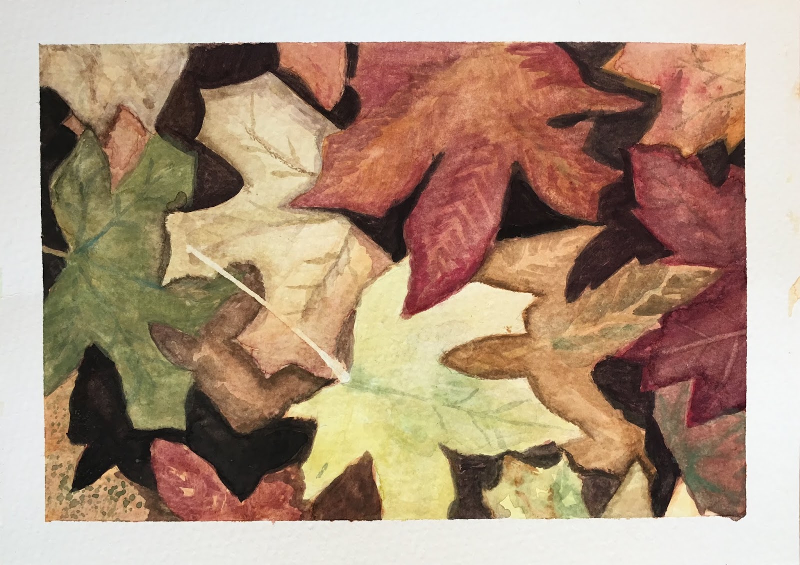
Negative space painting is a fascinating technique, which can result in artwork that has fantastic depth, dimension and interest. The process can feel a little counter-intuitive at first, but once you get the idea, it can be an enjoyable painting experience, and feels a bit like building a painting back into space.


As part of our watercolor journey, I wanted to introduce this process to my adults. A leaf theme seemed fitting for the fall season, and the leaf motif was simple enough to tackle with this new technique, while their basic shapes allowed for plenty of artistic freedom and personal choice.
To familiarize themselves with the process, my students watched a few negative space painting videos on YouTube before coming to class. There are many good tutorials out there, but here a few that we watched.

Video 1
Video 2
Video 3

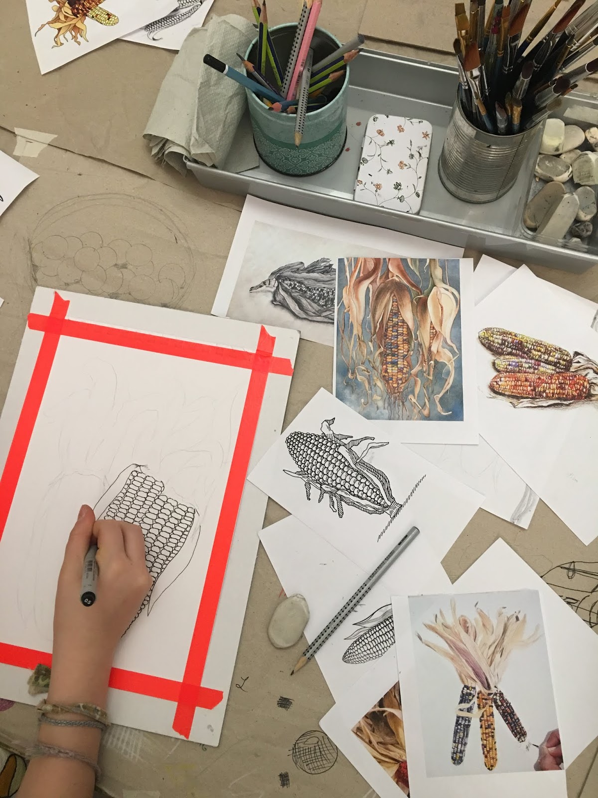
Students decided on a leaf variety to paint. Important was that their leaf shape is rather simple, since they'd be painting around this shape again and again in order to build up many layers of depth.
Students had many visuals of leaves to choose from.

Step 1: A light wash of color was painted across our entire paper. This first layer of color will eventually be the color of the leaves in our foreground, so those that are most in the front of our composition. A bit of variation in this first color adds interest, and will look more realistic, since leaves are rarely a solid, flat color, but are composed of many colors and imperfections. So splashing or dabbing a bit a different color here and there is all good, as long as this is also a very light color.
Step 2: Students sketch our a simple leaf composition with 5-7 leaves. For good composition, leaves should be facing in different directions, and should vary in size. These are the leaves that will be in the front of our composition.
Step 3: Begin painting. Students mix a color that is a bit darker than their first wash of color, and they proceed to paint AROUND their drawn leaves.
Step 4: Students draw several more leaves, again thinking of good composition. Some leaves should underlap those in the front.
Step 5: Students mix a color darker than their second color, and paint AROUND all the leaves.
Step 6: More leaves are drawn. Some underlap those in front.
Step 7: A darker color is mixed and again the leaves are painted around.

Continue these steps until the composition is full of leaves, there is lots of overlapping, and there is lots of depth.

Finishing touches
Students add a little more detail to their leaves, to make them more realistic, to add a bit of texture, or to enhance the shadow and highlights. This could include adding faint veins, imperfections, shadows were there may be a bend or indent in the leaf, etc. Very important for creating a sense of depth is adding a slight shadow along the edge of any leaf where it overlaps another.

One watercolor techniques we used for adding faint veins on our leaves was 'lifting', in which the color is lifted by lightly scrubbing the vein lines away with a wet brush.

My adults found his technique challenging but fascinating. It's one that requires a lot of practice, but for a first time exploration, I'd say we all did pretty well, and students went home happy with their results.