Wednesday, November 29, 2017

Nutcracker

 I did this project with my kids a few years ago but am just posting it now, just in time for the Christmas season.

All age groups enjoyed this nutcracker project. The bigger kids made full body nutcrackers using acrylic paint. We looked at human proportions, then discussed how these differ to nutcracker proportions. We noted that the our wooden friend has a rather stiff stature, with straight limbs, and a shiny finish, seeing as he's made of wood. We used a long format paper (A3 paper cut lengthwise, so roughly 14x42cm). These were folded lightly (without creasing) 4 times to section off our nutcracker proportions: head to neck, neck to belt, belt to knees and knees to feet, roughly. We drew in our body and added our own details such as crown, mustache, beard, belt buckle, boot details, epaulettes and cuffs. Our drawing was tracked in thick black permanent marker. We painted with acrylic paint (including gold!) and added a highlight side to our nutcracker by adding a touch of white to our paint to create a lighter value. This took 2-90 minute sessions.

The little kids class (below at bottom) made nutcracker heads using a guided drawing lesson. Together we mapped out the facial features with me drawing on the whiteboard and them following along. The kids drew directly on their paper with a black oil pastel. They designed their own crown details and mustache shape. These were painted in tempera paint. The background was then painted in black or green and painted carefully around our nutcracker. This was a 1-90 minute session.

6-9 year olds. Acrylic and marker

6-9 year olds. Acrylic and marker

7-11 year olds. Acrylic and marker
4-5 year olds. Tempera paint and oil pastel

3-5 year olds. Tempera paint and oil pastel

Tuesday, November 14, 2017

Storytelling Through Illustration


We've been looking at illustration and asking ourselves 'What is illustration?' and 'Where might we find illustrations?' Last week we practiced how to draw an animal illustration using simple line techniques to render fur, and show changes in value and tone.

Illustrations tell a story, and can often be found in children's book. Fort his project we continued our study of line and pen techniques, exercised our drawing from observation skills, and with the addition of a household or everyday object, we told a unique story. 

First, on scratch paper we practiced drawing several objects that we might add to our drawing. Teacups, coffee pots, scooters, glasses, bikes, lemon squeezers, etc.... whatever we though might tell a sweet, ironic, funny, or moving story when placed together with our animal.

Each student then chose a simple animal illustration and let herself be inspired by it. With careful observation skills, we drew our animal as we saw it, mapping out its features and shapes for an accurate copy. We then used pen to add lines, dots and dashes to create fur and show changes in tone. Thicker and denser dashes result in a darker tone. Wider spaced and thinner lines or dots create a lighter area.

Next, we added our everyday object to the picture. Lastly, we colored only this object, leaving the animal black and white for that graphic quality and for emphasis.


Kids 7-12


Kids 7-12


Jasper Johns Letters


Jasper Johns

After exploring several other American artists associated with Pop art who working in the 50's and 60's (Warhol, Thiebaud, Lichtenstein) we looked at the work of American artist Jasper Johns (1930) who crosses categories from Pop-art, to Neo-dada, to Abstract expressionism.

The name of the game is EMPHASIS and BALANCE.

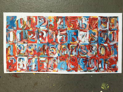
For this project we focused on his letter art. We noticed that his letters are simultaneously camouflaged and revealed against a busy background. We noticed that he used stencils, which he painted over or around, or sticker letters, which he painted over and later removed, revealing the under-paint.

We noticed also that he used a limited palette of mostly primary colors, allowing these occasionally to mix, creating oranges and greens, but for the most part, his middle blue, bright yellow and strong red steal the show, adding an intense visual excitement and energy to his work. Limited white is used to soften, to push back, to add contrast and to emphasize his letters.

Analyzing his brushstroke, we noticed that he used quick brush strokes to lay down dabs, lines and area of color. In order to allow his colorful letters to reveal themselves against am equally colorful background, Johns added suggestion of contour lines, touches of white, or a contrasting dabs or dashes of color to push the letter into the foreground.
Achieving a similar emphasis for our letters was undeniably our biggest challenge for this project. We also had to ensure that each square, each housing a unique letter, was distinct from its neighboring square. Not an easy task!

Process:
We began by dividing our 30x40 cm paper into 25 squares (5x6cm across, 5x8cm down). There are 26 letters, so we squished the 'I' and 'J' tightly together into one square. The kids loved this trick.

Then we traced the ABC's with aluminum stencils into the center of each square with pencil. Next, we started adding dabs and dashes of color to our letters. Working with one color at a time, we moved our brush around the paper to add a bit of one color to all letters. In order to avoid a too perfect and systematic application of color, and to have a more balanced feel, we were mindful that some letters might have more yellow, for example, and some might have less. Each letter, after all, should have a totally unique color combo, and contribute to the balance and harmony of the whole piece. That means moving our colors and textures around the paper.

Once all letters had dabs of all colors, we begin coloring in the background squares. We attempted to create a hard edge between squares in order to emphasis each one, but outlining them was not allowed. Instead, hard edges had to be created by dabs, dashes, and contrasting color choice. The background squares were painted in such a way that the letters both blended (color and texture) AND were emphasized. More dabbing was added and colors were adjusted to our letters to get just the right balance. The use of white was handy for this.

These turned out so beautifully.
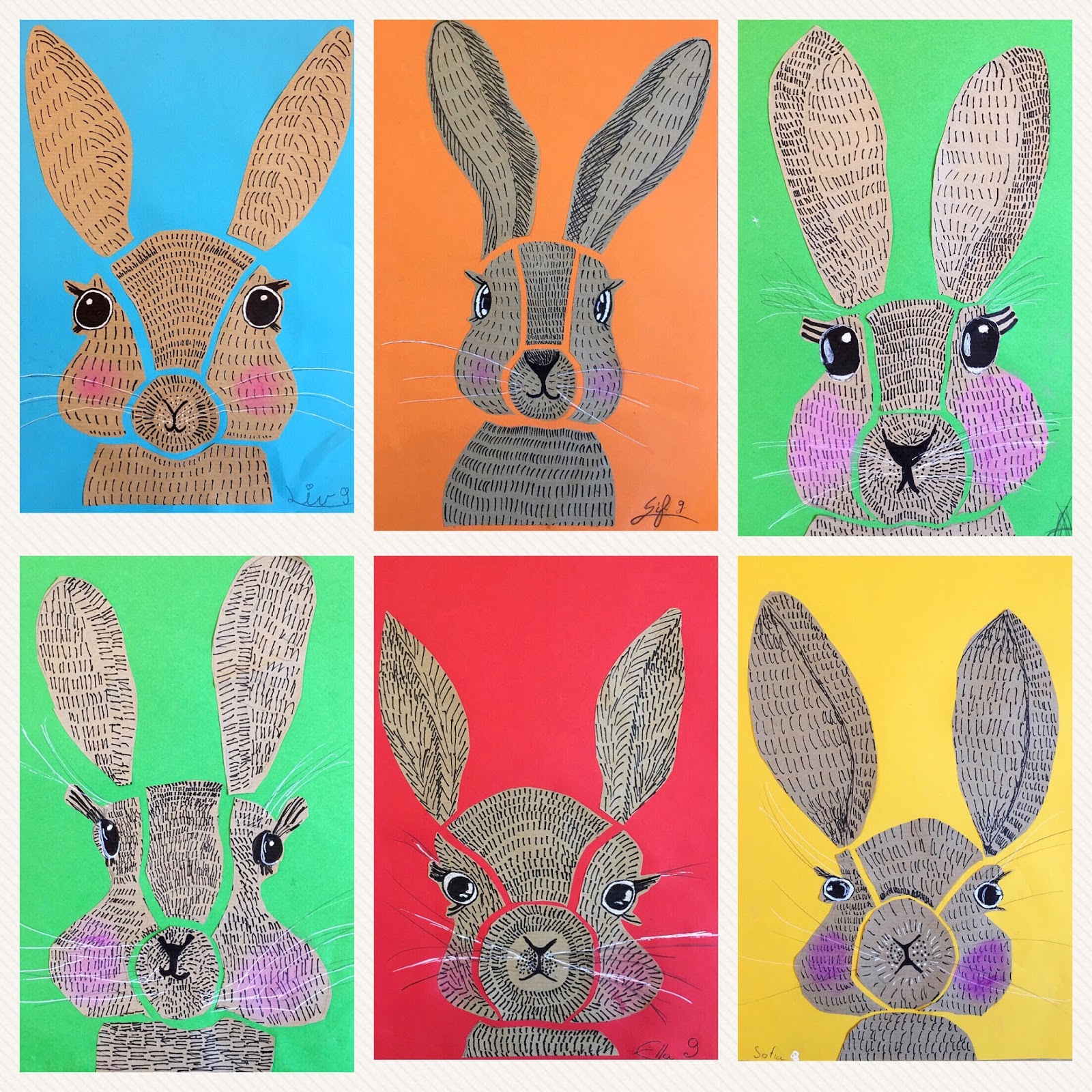
Kids 7-11

Kids 7-12


Friday, November 10, 2017

Lea Maupetit-Inspired Illustrations in Gouache


Our adult class looked at the beautiful work of illustrator and designer Lea Maupetit. We love her simplified forms, her restricted colors, her subtle patterns and her clean lines. In order to gain an understanding of the skills and techniques required to work with Gouache, each student interpreted Maupetit's work with this versatile and fun medium. These turned out so lovely. In an oversized white frame with a white passepartout, these are stunners and perfect for hanging in the kitchen!


Wednesday, November 8, 2017

Rabbit Illustration Using Line


Poster - Mr. Rabbit  #bunny #kinderkamer #kidsroom


This adorable rabbit illustration, which can be found on Pinterest, was the inspiration for our Rabbit Illustration Using Line project. I've been focusing on drawing and illustration with my kids classes, and I knew this would fit in nicely with my drawing curriculum. I adapted it for both my younger class and my older classes.

We learned how to use simple line (dashes, lines, dots) to create texture, render shape and give a 3-D structure to our bunny. I had the kids fill in various shapes with line for practice. We discussed how lines closer together create a darker area, and how lines spaced further apart create a lighter area. Short and long lines create different texture, and dots help to create shadows, subtle or extreme, depending on the quantity and density of dots.

I did a guided drawing on the white board and the kids followed on their drawing paper. They also had handouts of this rabbit at their desk, and could draw from observation on their own, according to their skill and comfort level. As always, we mapped out our basic features to get the proportions right, and then added the overall shape and details. We used the blank rabbit template to help us break our bunny up into sections, into which we would later add our lines (see below). We discussed how giving these sections a slight curve would give our bunny form, making it more 3-D.

Once drawn, we added big rabbit lashes - we referenced real rabbit photos and noted how their lashes are long, and grow out nearly horizontally from the eye, and are longer on top than on bottom. We also added a reflection spot in the eye to give character and dimension.

Next, we started adding our lines, or dashes, using permanent black marker. We thought carefully of density and direction. Our little hands were hurting after this project, due the repetitive motion of 'dashing'. But it was all worth it!

As a final touch we added cheeks in chalk, which we smudged with fingers in a circular motion. We used a white gel pen to emphasize the whites in the our eyes and to draw whimsy whiskers.

Rabbits were cut out and mounted on brown drawing paper for the little kids. The bigger kids cut their rabbits into 7 sections, and reassembled these sections onto colored paper, leaving a small space to create that graphic look. Had we had more time, I would have had the little kids do this last step too, but time was short.

These were done in one 90-minute class. We are fast and furious, just like our rabbits! This project can be adapted in many ways. There are some cute ideas, including handy printable templates, here. I preferred to have my kids draw their own bunny, rather than use a template, because this was a drawing-focussed project.


konijn - streepjes - structuur - zwarte stift


Little Class, above, ages 6-7


7-10 year olds

7-13 year olds