Thursday, February 28, 2019

Graphite Teddy Bears

Graphite is fast and immediate. Kids love it for this reason.

Exploring and understanding graphite also provides a strong art foundation, which can easily translate to other art media: value, tone, form, highlights, shadows.... we address all of this with graphite, and we can use this knowledge in future painting or dry media projects.


We've done many dry media and drawing projects in the Art Room, but very few focussing on the properties of graphite. I knew I wanted a drawing project where graphite was in the forefront. With a drawing project also comes observation - teaching my art kids how to 'see' is one of my highest priorities - so I wanted a subject that they could relatively easily render using their observation skills and with simple graphite techniques.

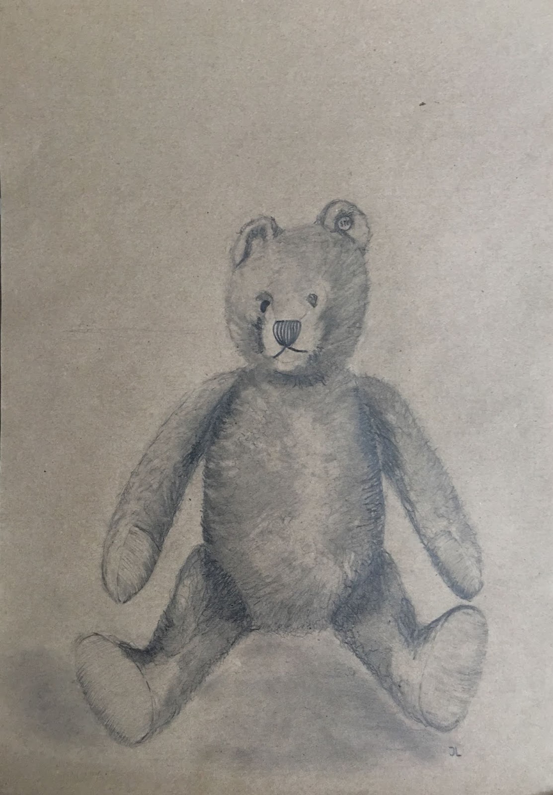
Teddy bears are made up basic shapes (circles, cylinders), and if you don't get it 'just right', it will still look good. There is plenty of playing room for explorations of texture and values, and all kids love this cute plush toy. So, teddy bear it is!

Teacher Sample
I found this great graphite teddy bear video tutorial on youtube, which ended up being the basis for how I approached this project with my kids.

Materials:
-Good sketching paper.
*We used a slightly textured, yellow-beige paper, by Crayola. A little texture is key, as it grips and holds the graphite.
-2B and 4B graphite pencils
-Kneaded erasers
-Blending stubs
-Tracing paper (optional)


Process:

Students were shown dozens of photos and drawings of teddy bears. Each student chose one which he would draw. I also chose one, and set up a paper on the white board, on which I would demonstrate step-by-step how to draw, shade, blend, highlight and texturize our bear.

A few of our bear choices
Drawing:

We broke down our bear into basic shapes. We looked at head, body, legs, arms and considered their shape (circles, oval, cylindrical, egg-shaped, etc.). Students laid a piece of tracing paper over their teddy bear pictures and traced the basic shapes of their bear. This helps them visualize the distinct shapes and elements which make up their bear.

Using our 2B pencils, we then drew out our bear, following the basic shape break down, on our good drawing paper. We made sure to leave a thumbs-width of space at top, bottom and side of our paper for good composition. Students were encouraged to see exactly where the bears arms attach (at his neck!) and where the feet are placed (often blocking view of the legs). Seeing where one part of an object begins and where it ends is key when drawing by observation.

*I showed students how to hold their pencil when sketching (gripping it from top, and very loosely sketching with large, loose motions 'from the shoulder'. Sketching the head may require us to sketch out a circle shape 10 times before we get it 'right'. Students were NOT given erasers, so they had to sketch lightly, and ignore their 'unwanted' lines. When done, we went back over our 'good' lines with a slightly darker line.

Using our 4B pencil, we now shaded all parts of our bear one section at a time, starting with the head, ears, snout and making our way down. I quickly showed students how to shade a sphere and a cylinder, so it looks 3-D (by following the shape of the contours, and by thinking about the form of our shapes), and then we were off.

Using a blending stub, we then blended all parts of our bear, following the same contour-following technique we used with our graphite, to maintain our 3-D form.

Eyes and nose were drawn in darkly, with reflection spots in our eyes (always!).

Student knew right away that something was 'off' with their bears at this stage. Their bear was all the same value, lacking any and all highlights and shadows! We had only created the bear's middle value at this point. Shadows and highlights are our next step.

Highlights:
Using a kneaded eraser, which we made to a point, we began 'lifting' up the graphite wherever we saw strong highlights on our bear photo. I like to say that the kneaded eraser is just another drawing tool, which allows us to 'draw' in the highlights. Some students had to be encouraged to add more highlights, or stronger highlights, to achieve greater contrast. Erasers were also used to 'dab' up some texture in our graphite.

Shadows:
Next, we took our 4B pencil again and began shading in the areas where there were strong shadows. These were most often under the arm, under the chin, between the legs and at the bottom of our bear, where the ears attach to the head, etc. These new shadow areas are also blended with a blending stub.

*Having students observe, observe and observe again is key. So often they think they are 'done' too soon. The more shadow and highlights they add, the more 3D their bears will look, so don't let them skimp on these steps. Once they see their bears come to life through strong shadowing and highlighting, they are super motivated to keep at it.

As an optional step, and if time allows, texture is added by lightly and minimally scrambling here and there with our pencil, or by picking up more graphite with a pointed kneaded eraser. This texture can also be blended with fingers or blending stubs.

Students then scanned their bear and compared it to their photo. They went back in and added more highlights, darkened shadows, and created more texture where they saw fit.

Eyes and nose were darkened. We found a darker graphite (6B, for example) was best for this step, for a stronger contrast.

These all turned out so well, and are all so adorable. Students were surprised at how realistically they were able to render their bears.

Kids 8-14 years
Kids 9-11 years
Kids 7-9 years
Adult class
Aditri 8
Zoe 9
Yiming 7
Daniel 9


Mathilda 7
Rune 7


Sif 10
Ciara 8


Marko 14
Dasheng 11
Ella 11


Sofia 9
Liv 10
Skye 9
Ben 10

Phoebe 10
Anastazia 9


My adults also really enjoyed this project. They worked on a larger format and on darker paper. 
Their results are below. 
My Australian student chose to draw a koala bear!


Wednesday, February 27, 2019

Shelli Walters-inspired Mixed-Media Collaged Flowers

Collage is one of my favorite things to do in the art room. I love the sight and feel of different papers. Their infinite patterns, colors and textures are exciting and engaging to art students and art viewers alike.
Thursday Adults
Tuesday Adults
For my collage projects I use a wide and diverse selection of papers. I like using both neutral toned papers, solid colored paper, and patterned paper.
I prefer paper from older books, because I find the paper is often thicker, more textured, and yellowing.

Examples of my favorites are:

NEUTRALS
Old book paper (in various stages of yellowing; larger print and finer print; different fonts and languages)
Old dictionary or encyclopedia paper
Atlas paper and maps
Lined music composition paper
Sheet music (both in simple and complex compositions)
Gridded paper (math notebooks, drafting paper)
Bakers or deli paper

SOLID COLORED and PATTERNED
Gift wrapping paper
Decoupage paper
Colored construction paper
Origami paper
Homemade painted paper
Homemade stamped, stenciled, and printed paper

Now on to the project.

Shelli Walters is an Oregon-based artist and graphic designer. Her collage work is intensely satisfying to look at. The richness of color, texture, pattern and dimension is often offset by a gentle background, or negative space painting, in a soft tint. I love this contrast. Her work was an instant must-do with my classes.

This project is meant to be freeing. No overthinking. No scissors. No erasers. No details. No need for a perfect drawing.

STEPS:

1. In pencil, using your non-dominant hand, draw 4-6 flowers with stems and leaves. Flowers should be simple (poppies are great for this). They should vary in size and angle. Fill the bottom of your composition with plenty of leaves and stems for visual wight and a natural fullness.

*Create an 'open composition' - i.e., your flowers should be going off the paper on at least 2-3 sides.

2. Choose your flower color. Paint flowers, stems AND leaves in this one color. Your color should be bold and not too light (dark red, bold blue, dark green are good choices).

3. First Negative Space Painting: Choose your background color. Paint the 'negative space' around your flowers, leaves and stems in this color. This color should contrast with your flower color.

4. Collaging:  Gather a selection of collage papers in the color that you painted your flower. If your flowers were painted blue in step 2, choose blue papers in a full range of blues, including neighbor colors if you like (greens or purples). Also include neutral papers (book, music, dictionary paper). Make sure to include both patterned and solid paper.

Flowers:
Paste scraps of collage paper in this color on your flowers. When pasting collage scraps, DO NOT COVER the whole flower. Instead, let some of the initial painted flower color show through the collage scraps, or allow for this color to define the contour edges of your flowers. Think of the collage scraps as enhancing and accenting the original flower color.

Work in progress
Work in progress
Tear, do not cut the paper, for a more organic shape and edge. Make sure there are no straight edges or corners on your scraps, as this will not look natural. Do not overthink this step. Just tear and paste, creating a visually pleasing arrangement. Go for pedal shapes, or simply paste in a spiral. Whatever you like.

For 'unity', use each patterned or colored paper more than once throughout your composition.

GLUE: We used acrylic gel medium to paste our papers. We glued 'under and over', like you would when decoupaging.

Stems and Leaves:
You may choose to use the same color scheme in your leaves and stems, or you may choose a range of greens, blues and naturals for a more 'realistic' look. To create 'weight' at the bottom of your composition, fill it up with leaves, stems, flower buds, etc. This area could be collaged with darker papers for a fuller, denser, more shadowed look.

5. Second Negative Space Painting: Repaint the negative space around all flowers, stems and leaves once again in a lighter tint of your original background color. If your background color in step 3 was red, you will use red with PLENTY of white for a light tint of red. The goal is to go super light with this step, so use lots of white. This soft tinted background will offset the bold colors and patterns in your composition, emphasizing your flowers.

*Use your brush loosely in a stippling motion in this step, and allow some of your original background color (for example, red) to show through, particularly around the contours of your flowers, stems and leaves. This will create interesting bold contours, color contrasts, a shadowing effect, and texture.

6. Refine and add details. You may choose to paint a dark center in your flower, or paste a few more scraps here and there for balance and unity.

7. Ensure any paint is dry. Apply a full coat of acrylic medium (in glossy) to add a glossy sheen to your composition, and to fully seal all collage papers.

We did this project in one 3-hour class on 30x40 cm acrylic paper.

This project was so much fun, and it was so wonderfully tactile. Everyone went home begging to do more collage projects.

Maybe we'll try Shelli Walter's landscapes next? Who knows!


Friday, February 22, 2019

Still Life with Fruit and Vase - Tempera and Soft Chalk Pastel

Thursday Adults

Every now and again I like to throw a still-life project into the curriculum. It provides for solid academic art training and skill building, and can be rendered in any medium or style, so the options are endless.

My adults had not done too many projects with soft chalk pastels yet, so I thought I'd start there. To make this one extra luscious and exciting with a different twist, I decided I'd add an extra element: tempera paint underpainting.

Painting our background and our still-life elements in a flat coat of tempera paint first provides our fruit with a richness and a deep intensity. This base, over which the chalk is layered, shines through the final chalk, giving a far more vibrant result than you would otherwise get with white paper.

A chalk underpainting also takes a little pressure off of working with chalk. I find chalk is a really challenging and messy medium. Without a vibrant underpainting, students tend to overwork and over blend their chalk in order to get the bold results they are going for. The problem here is that when chalk is overworked, it actually loses it's intensity and character, becoming diluted, muddy and flat.
With an underpainting, the main color of our fruit is already in place, so we can focus on using our chalk to add the strong accents, highlights, shadows and texture, without the mess and stress of covering the entire paper with a layer of chalk.

I rarely use tempera paint in the art room. I find it too chalky, streaky and transparent for most of our purposes. However, it's perfect for this application, since it's just an undercoat, and the chalkiness actually serves to 'grip' and 'hold' the layers of chalk.

 Process:

Students sketched out an original still-life in pencil using a combination of reference photos.

Using basic school tempera paint, students painted the main color (or local color) of each fruit, element, and their background and table. Color was applied flatly, without toning. 

Next, students began shading their composition with chalk, focussing on the changes in value and creating soft transitions between these in order to render a realistic sense of form. 

Fingers were uses to smudge and blend. Students were encouraged not to over blend. Colors were layered over top one another, edges blended out with fingers, and shadows and highlights added. 

Background walls were done is several colors, using a scrumbling method, for that textured, vintage look. To scrumble, use the flat side of the chalk and loosely and quickly 'scrumble' the chalk in different areas on the wall. Repeat with 1-2 more colors (near each other on the color wheel to avoid browns), and then softly blend edges together with a finger, or scrumble over top the edges with a white chalk for a brighter, softer blend.

Chalk pencils were used to add details and to refine contours. 

Final pieces were sprayed with fixative.

My adults were pleasantly surprised by their results. It sparked a new-found love, respect and curiosity for the humble chalk medium. 

This was a stress-free and quick project with excellent results that was completed in one session (3 hours).