 |
Teacher Sample
|
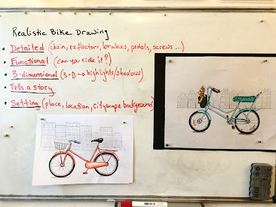
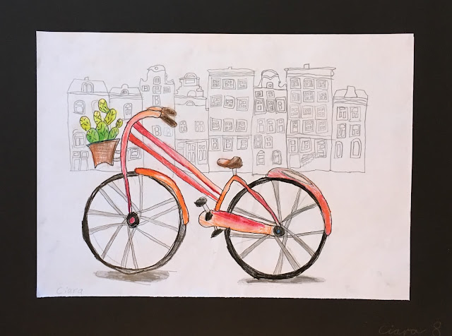
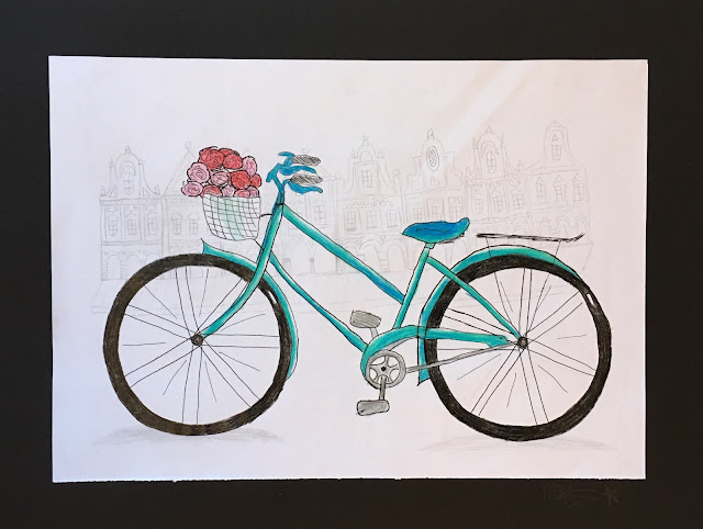
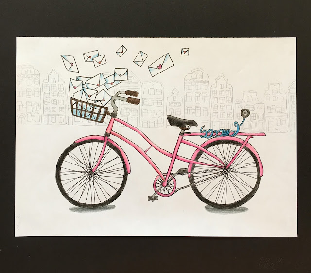
My 8-14 year old age group classes really loved the Bike Names project we did at the start of the semester, which was conceived as a way for them to exercise their line, art principles and design skills after the long summer break. I find my kids love the challenge of developing a drawing, paying attention to detail, personalizing a piece of art, and drawing with pen. For all these reasons and more, I knew I would extend the Bike Names project into an ultra detailed, hyper challenging piece. So, here we have it: Bike Illustrations with attention on Form, Function, Setting and Story-Telling. Additionally, this project required close observation skills, careful line work, developing a unique concept or idea, and continuous critical analysis of form and function. Like real designers, we were tasked with a myriad of complex problems required solving. An exciting challenge!
 |
| Objectives |
Bike Analysis:
To begin, we looked at many examples of bicycles in various styles, and analyzed their form and function. I printed out all kind of visuals, including illustrations, silhouetted bikes, simple drawings photos, etc. We asked ourselves many questions: What style does this bike have? What shape of frame? Shape of seat? Shape of handle bars? What makes it function? How does a mountain bike differ from a grandma-style city bike? How are the different elements connected to one another, for example, chain to chain ring, breaks to break wire and break clamps, mud guard to wheels, pedals to chain ring, etc. And by the way, we did not bother too much with all the 'correct' bike parts vocabulary. In fact, we were fumbling our way through all the names of these bike bits and pieces, multi-lingual and guess-working half the time, but bike vocabulary was not on the tippy-top of my list of important things to convey in this project. It could certainly be a great opportunity for technical vocabulary building with more time and dedication though.
Developing Idea:
Students were given scrap paper to sketch out preliminary ideas for their bikes. They had to consider their bike style with frame shape. They had to consider all the elements and details which would allow their bike to be functional, regularly asking themselves: does it go? Details details details! If you have a handle break, where does it connect to? Is your chain connected to the chain ring?
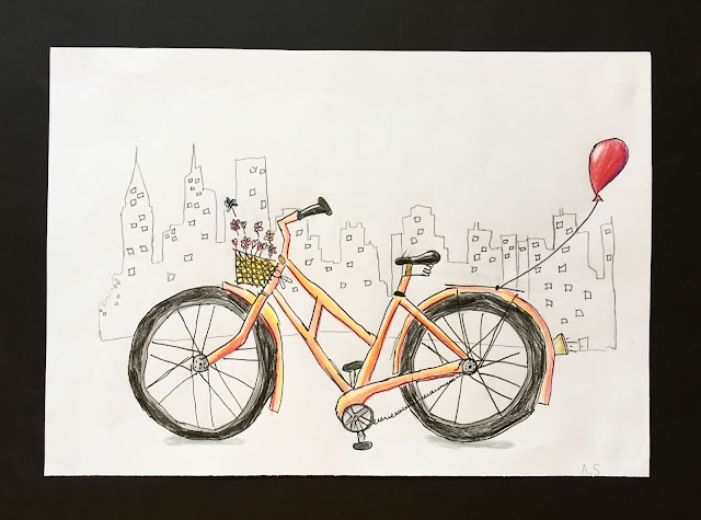
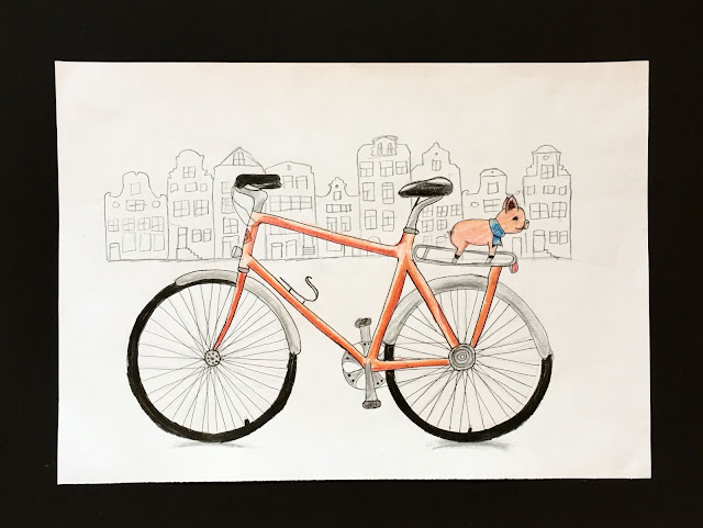
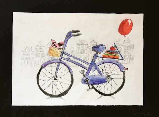
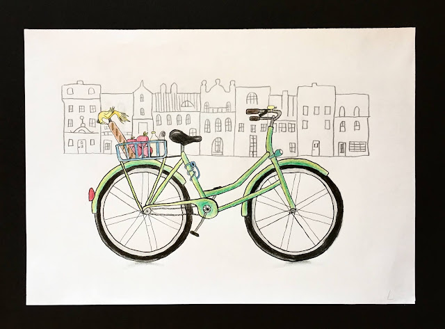
Illustrations are more interesting when they tell a story. Students had to add elements to their drawing which do just that. It could be as simple as a basket with flowers in it, or a balloon attached to the back of the bike.
Drawing:
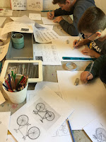 |
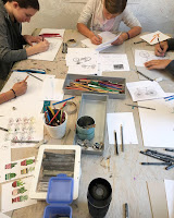
| Hard at work |
Once we were happy with our ideas, we drew our bikes on good paper. We used marker paper because of its smooth surface, which accepts color and pen line really well. We used masking tape rolls as templates for wheels, then begin drawing in out various lines and details in pencil. We traced our pencil lines in fine liner marker in various widths. The smaller widths were for our tiny details, and spokes, while the bigger widths were for our frames and our larger areas. This gives variety and emphasis to our drawing.
Coloring:
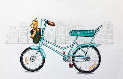
We colored out bikes using one color of colored pencil, plus its lighter and darker shade. We considered our light source, and shaded our bikes accordingly, leaving areas uncolored or lightly shaded where there is light reflection. Colored pencils can be easily blended together for a seamless transition of values, and for a strong dimensional effect. Again, it's all in the details: even our seats, our bells, our flowers and our baskets have a shadow and a highlight side.
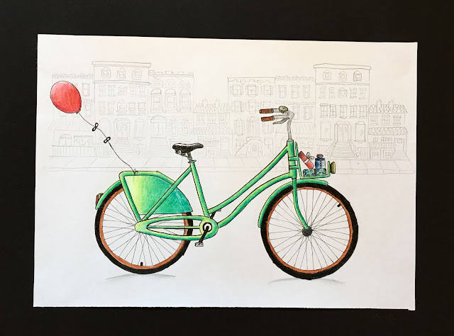
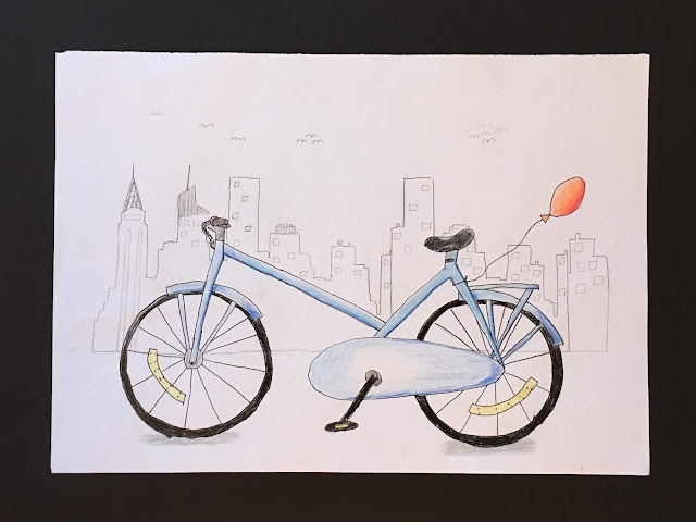
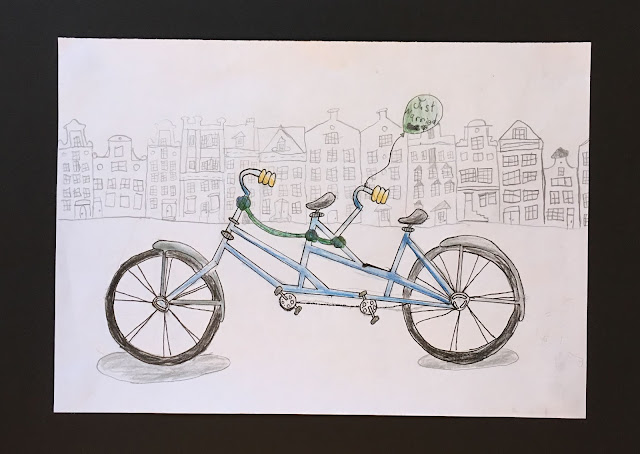
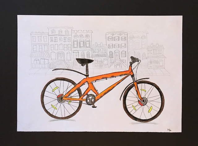
Setting:
To place our bike in a setting, we simply placed our marker paper, which is slightly transparent, over top of print outs of cityscapes (like New York, Berlin) or rows of houses (like Amsterdam, Brooklyn), and traced the lines with a pencil. There are plenty of options to choose from, which can printed from the internet by simply searching on Google images for 'row houses', 'Amsterdam town houses', 'Brooklyn brownstones' etc. We chose pencil in order to keep the background setting soft and distant, and to not interfere with our more important foreground subject.
Finishing Touches:
We added a dash of slight shadow under our wheels using a gray colored pencil.
We then pasted our paper onto black construction paper to give it a structured backing and to make our illustration pop.
My students loved this project! All ages, 8-14, were able to work at their own level and experience success. Win-Win.
 |
| Age 9 |
 |
| Age 10 |
 |
| Age 10 |
 |
| Age 8 |
 |
| Age 10 |
 |
| Age 9 |
 |
| Age 9 |
 |
| Age 9 |
 |
| Age 14 |
 |
| Age 8 |
 |
| Age 11 |
 |
| Age 13 |


 Once we were happy with our ideas, we drew our bikes on good paper. We used marker paper because of its smooth surface, which accepts color and pen line really well. We used masking tape rolls as templates for wheels, then begin drawing in out various lines and details in pencil. We traced our pencil lines in fine liner marker in various widths. The smaller widths were for our tiny details, and spokes, while the bigger widths were for our frames and our larger areas. This gives variety and emphasis to our drawing.


