Thursday, June 16, 2022

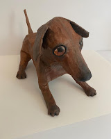
Dog Sculpture - Paper Maché


Teacher Sample

I was eager to make a dog sculpture with my students, and was searching for something using paper maché and newspaper. I came across this dog sculpture tutorial and knew this would be challenging and engaging yet manageable to do with my 9-13 year old group. 

Day 1
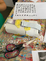
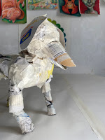
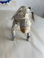
For our body armatures, we used newspaper with cardboard and rolled up magazine paper for support and structure. For our legs, we scrunched newspaper together to create thick upper thighs and thinner legs. We taped these onto our body. This gave our dogs realistic looking thigh muscles. We added cardboard stacks to add height to the neck, and then made the head with a simple ball of newspaper. The snout was made with two pieces of curbed and rounded cardboard - one for upper jaw, one for lower jaw (slightly smaller than upper). These were taped onto the head, the head taped onto the cardboard neck. 
Ears were simple cardboard pieces cut in ear shapes and either taped up or down. Tales were rolled up magazine paper taped to the behind. 

Day 2
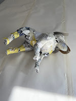
We made our own paper maché paste using simply water and flour. We dipped strips of paper into the paste, and layered piece by piece over our sculptures, overlapping each piece slightly and smoothing it out. This process made our dogs sculptures increasingly heavy, and we found that adding support structures to our dogs while working prevented the legs and tails from collapsing under the wet weight. We use plastic cups, plastic bottles and yogurt buckets to rest our dogs on while working. We also used these support elements during the drying process. This allowed us to prop up our dogs, their tail and legs for drying. 
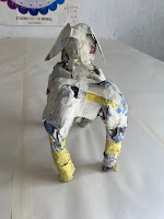
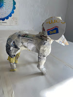
torso

Day 3
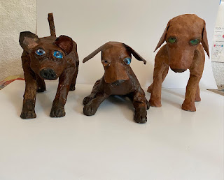
We drew eyes on paper with marker, then glued these to the back of glass cabochons. These are our eyes.  We used air drying clay to mold noses into the snout area, and to mold feet into the bottom of the legs. We stuck our eyes onto our heads using a clay backing, and added clay around the eyes to create an eye area with lids and brow. Wherever we used clay, we added additional strips of paper maché to secure the clay to the sculpture. See the above video for clarity on this.

Day 4
We painted our dogs using acrylic paint. Students were encouraged to use at least 3 colors of paint, mix their own browns, and to add a bit of definition around the eye area using a darker tone. When these were dry, we glazed our dogs with a coat of acrylic matt medium.

This was a sometimes tricky and lengthy process, but we learned so much and came away with wonderful dogs! 

DAY 1 & 2
cup for tail support

clay noses, paws and eye area

adding the nose and paws
nose and eyes in the works

drying on radiator for support
support during drying process


DAY 2 & 4


Toilet Paper Hamburger Sculpture


In my research for paper-based 3-D sculpture project, I was intrigued by the use of toilet paper and water for creating realistic food sculptures. There are many tutorials online for these, but I found this one to be a straight forward and thorough one: Toilet Paper Food Sculpture

For my students, ages 9-10, I knew this would be an engaging and different way to create 3-D art.

Students were each given a role of toilet paper, and they created multiple elements for a burger. We made patties, buns, fried egg, lettuce, tomato and cucumber slices, onion rings, cheese and bacon. The key here is to not use paper that is too soaked. This took some experimenting and was a trial and error process - like all great art, but the kids got it down pretty quickly.  For thicker pieces, we wrapped dry toilet paper in wet toilet paper - this bulks up our sculpture more efficiently, and quickens the drying process (preventing molding).

We set these aside to dry for a week, until our next class.


The following class, we painted our sculptures with watercolor. Prior to class, I explored painting them in acrylic, and found that, while it held everything together better and did not re-soak the toilet paper as much was watercolor, the results were not as realistic. Watercolor soaks into the paper (which can be tricky because it rewets out sculptures), but the results are more dynamic, creating more natural variations in value and tone. This results in a naturally more realistic sculpture. 

Students explored color mixing for just that right food color, and were encouraged to use 3 colors (or tones) per food piece. 
So, a burger would have brown, ochre, red and black, for example.
Lettuce might have two greens, yellow and blue. 
Bacon has red, brown and black.
Cheese has two yellows and orange, etc. 
Color was applied quickly, often with a dabbing motion, to precent the paper from soaking and pilling too much. 
We used white acrylic for the sesame seeds, and black permanent marker for the grill marks. 
They look great piled up into a burger, but look even better, showcasing all their beauty, displayed on a plate.

These were super fun and really wowed the kids. 


Friday, May 20, 2022

Spring Floral Landscape - Gouache and Mixed-Media

Student work, ages 9-13


Student work, ages 12-13


Teacher Sample


My students ages 9-13 looked at the beautiful spring landscapes of English artists Jo Grundy. Our learning goals were many! We focused on building a landscape with special attention to atmospheric perspective, color mixing and scale. We considered how distant objects appear smaller, less detailed, and less saturated. We looked at various options for creating texture: we used gouache paint with many drawing implements and painting techniques to create these, including credit cards, Q-tops, tooth picks, dry bristle brushes and colored pencils. So much problem-solving and technique exploration went into these small format pieces. So inspiring to see kids work their way through complex tasks.

Materials: Gouache and mixed-media on blue mixed-media A3 size paper. Some students cropped the size a bit.

Tip: Taped borders results in a clean finish. We used washi tape.

Exploring color mixing and using various brushes for texture.

First Step: a light layer of colors - softer, less saturated color in the distance, bolder up front.


Next Step: adding texture and detail. Closer elements are more saturated in color, and more detailed.

Layers of texture: dry brush dabbing, Q-tips, credit cards scraping. 

Tip: Start at the top and back, moving down to the bottom and front. This prevents smudging and encourages overlapping.

Students slowly build up the landscape, adding increased texture, detail and saturation up close. We then add a house, a distant tree, clouds with shadows, birds in the sky, etc. to finish these beauties off. 

Done!

Student work, ages 9-13


Tuesday, April 5, 2022

Tiger on Branch - Stylized Mixed-Media


Class collage - ages 9-11

To commemorate Chinese Lunar New Year (2022 year of the tiger), my Monday kids painted tigers on a branch with varied jungle foliage. Our objectives were plentiful for this lesson, resulting in much learning, problem-solving and superb results.

OBJECTIVES:
  • Observational drawing (tiger face, tiger body in lying posture on branch)
  • Draw a variety of jungle foliage and flowers from imagination and from observation
  • Establish a landscape (sky, horizon line, middle ground, foreground)
  • Composition - use of overlapping and variety
  • Gouache painting and blending techniques
  • Color mixing (with a variety of greens)
  • Outlining for contrast and refinement
  • Use black marker to create a stylized-look
  • Use colored pencil for added texture and color variations
*A Note on Gouache:
Gouache is my favorite paining medium. Unlike acrylic, gouache is water-based and can be reactivated after dry. It's easy to use, as the texture is creamy and smooth. Because it does not dry quickly and permanently like acrylic, colors can be mixed and easily blended directly on the paper. It works superbly with mixed-media, as other media can be easily applied overtop. It's highly pigmented and intense, meaning a little goes a long way. My gouache comes in tubes, so I used to squirt paint for each student on their palette. I realized that I was throwing so much away at the end of each class. Now, I dispense gouache into small containers, and have my students simply dip their brush in the color they need, then mix it on their palette for personal use. Paint waste has been significantly reduced, as students only take what they need, as they need it. Once on their palettes, they explore with color mixing, leading to unique colors and tints. When the paint dries in the containers, I simple refresh/reactivate with a bit of water from a spritz bottle, and a spritz of rubbing alcohol to prevent molding (this can happen when not in air tight containers...).


Gouache in small containers
 for shared use reduces paint waste

Individual palettes for mixing colors


STEP 1:
Students chose a tiger on a branch from a selection of photographs. They practiced drawing the face and posture of the tiger, using basic shapes (circles, ovals), and then refining the proportions and shapes, and adding details. I drew several tigers on the whiteboard to demonstrate this use of basic shapes. 

STEP 2:
On pink paper, students established a basis landscape (skyline, horizon line, middle ground, foreground), and placed a large tree off to one side, with a branch or tree stump for the tiger to lie on. They drew their tiger on their branch, and added a variety of LARGE leaves and flowers for a FULL, interesting composition with plenty of VARIETY. These were largely drawn from imagination, with some from observation. 

STEP 3:
Starting at the top and working their way down, student painted their background areas, leaving out anything in the foreground (so sky, hills, background grass, branch). Students were encouraged to mix interesting colors, blend directly on the paper, and use white to mix softer tints). 

STEP 4:
Students painted all the elements in their foreground (leaves, foliage and flowers), and then the tiger. Again, color mixing and creating tints was key. Many greens, mixed with blues, yellows, browns and white creates a dynamic and varied composition. 

STEP 5:
Students outlined all contours with thick black permanent marker. Tiger stripes were drawn with black marker, and smaller marker for face details. They added dots and dashes for added texture and interest.

STEP 6:
Colored pencil was used to add more depth in value, to add extra color variation, and to create more texture.

These turned out so bold and powerful - the black outlines really make all the elements pop.

WORK IN PROGRESS
Paint sky first, in blended sunset colors

Paint all background sections
Address foreground elements next

Working on the foreground elements

Paint tiger last


FINISHED WORK