Tuesday, December 18, 2018

Jo Grundy-inspired English winter landscapes in gouache

I recently discovered and fell in love with the art of UK artist Jo Grundy. Her beautiful work can be found here. She paints mainly landscapes of her native England, in different seasons. Her work is so detailed and textured, and has a graphic quality. The atmosphere her work exudes is calming and dreamy, particularly her winter landscapes. 

Thursday adult class collage
Tuesday adult class collage


For my adults, I was seeking a project into which I could build several particular objectives: a landscape which presents atmospheric perspective; an atmosphere or scene fit for the pre-holiday season; an introduction to gouache, a new medium for most of my adults; and a limited color palette.

Jo Grundy's winter landscape work was just it! Her overlapping rolling hills create beautiful landscape depth. Each hilltop is painted with elements (trees, houses, shrubs) which are fit to scale according to the depth of her picture plane - and these in turn are painted according to the laws of atmospheric perspective:  things that are future away from the viewer are higher on the picture plane, subtler, less detailed, blurry, lighter, and warmer in color, while things closer to the viewer, or lower on the picture plane, are more detailed, crisper, a most intense color, darker and cooler in color.  Observing and replicating this helps my students understand atmospheric perspective, which is an important skill in painting. 

Jo's winter landscapes also use a limited palette with tints. I love the idea of limiting palettes, as it forces students to mix their own colors. Creating tints with a limited palette infinitely expands our palette while maintaining a cohesive and harmonious atmosphere of soft, cool, wintery tints and tones. 

Color palette: 
Blue (ultramarine and cobalt), burnt sienna and burn umber, a dark green (but you could mix your own), a touch or red and yellow and plenty of white. Students mixed blues and browns together to create grays. Blues, green and black were mixed for our dark hedges and trees. To darken any value (for things lower in the picture plane) we simply added a hint of black or burnt umber, while we added a touch more white to soften or lighten a value (for things further away on the picture plane). 
White was used throughout to create soft pinks, blues, grays, and of course, the snowy white.

Brushes:
We used many different brushes. Very important was a tiny detail brush (#1 or 2) for our smallest, fine details. We used a round brush with a good tip for our larger areas. A bristle brush was used in a dry brush technique to stipple white paint over top of our elements to create snow, shadows or texture. This is a super fun technique that adds instant dimension and realistic texture to our landscape elements.

Process:
Students chose a Jo Grundy painting that they wished to reproduce. We taped the borders of our watercolor paper with artist tape or washi tape, which will give us a beautifully clean and crisp border when done. We began by lightly draw in the basic landscape shapes in pencil - so the hills and fields. No details were drawn in, as these would be painted in directly at a later stage. Larger houses were drawn in, but smaller ones were not.


These basic landscape shapes were then painted. We started from the top of our composition and moved downward. Sky first, highest hills, middle-ground hills, foreground fields, etc. We observed the values in our landscape shapes closely and tried to achieve a close value match. Important is not that our color matches the colors in the pictures exactly, but that the 'value relationship' matches. This will ensure that our atmospheric perspective is correct. In Grundy's work, each rolling hill has a slightly different value as it comes down the picture plane. This gives the illusion of depth and distance.


Once these shapes were blocked in we slowly started adding in the foundation of our details, always working from top down: hedges, trees, houses. Hedges were dry brush stippled with a flat head bristle brush in a dark color (a mix of blue, green and black or umber). Once dry, white was dry brush stippled over top for the snow. Trees were painted in a similar dark color with a detail brush, and snow was dry brush stippled over top the branches with a bristle brush. This technique was used in other areas too, wherever necessary, such as chimney smoke, a snowy rooftop, smudgy shadows, or for texture in flowers or a field. Detail brushes were used to add birds, animals, flowers and weeds. 


Thinking like an artist: Some students used credit cards to scrape paint upwards to create the texture of weeds and grasses in their foreground. Some students used colored pencils to sketch in very small details, where a brush might not do the job. Colored pencil was also used by some to add texture to areas with fine detail, such as a pebbly walkway. Throughout this project my students exhibited great creativity and problem-solving in figuring out how best to recreate Grundy's work. This is one reason why I really love having students copy other artists' work: it forces you to be creative in looking for solutions and exploring possible outcomes.


This project was definitely challenging and the process was slow and deliberate. It took us two 3-hour sessions to complete. Students worked in deep concentration and were totally zen throughout. My role was to help guide them in their process, assist them with color mixing, give periodic constructive critique and support with positive words and encouragement. In the end, they came out of a  near-euphoric stupor having learned so much about color mixing, the power of observation, atmospheric perspective and creating texture. They created luscious, beyond beautiful work that truly amazed. We were all elated by the experience. What a wonderful way to round out a great semester in the Art Room - and we have Jo Grundy to thank for the awesome inspiration!


Friday, December 14, 2018

Christmas Cars

Kids 8-14
Kids 8-11
For our final project of the fall semester I wanted a project that incorporates some of the techniques and skills that we practiced over the last weeks.  I wanted it to be somewhat holiday or seasonally inspired, and should span over two class periods so that we have plenty of time to develop our piece and take care to create something detailed and unique.
Kids 7-8

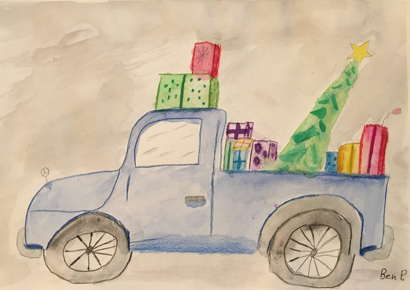
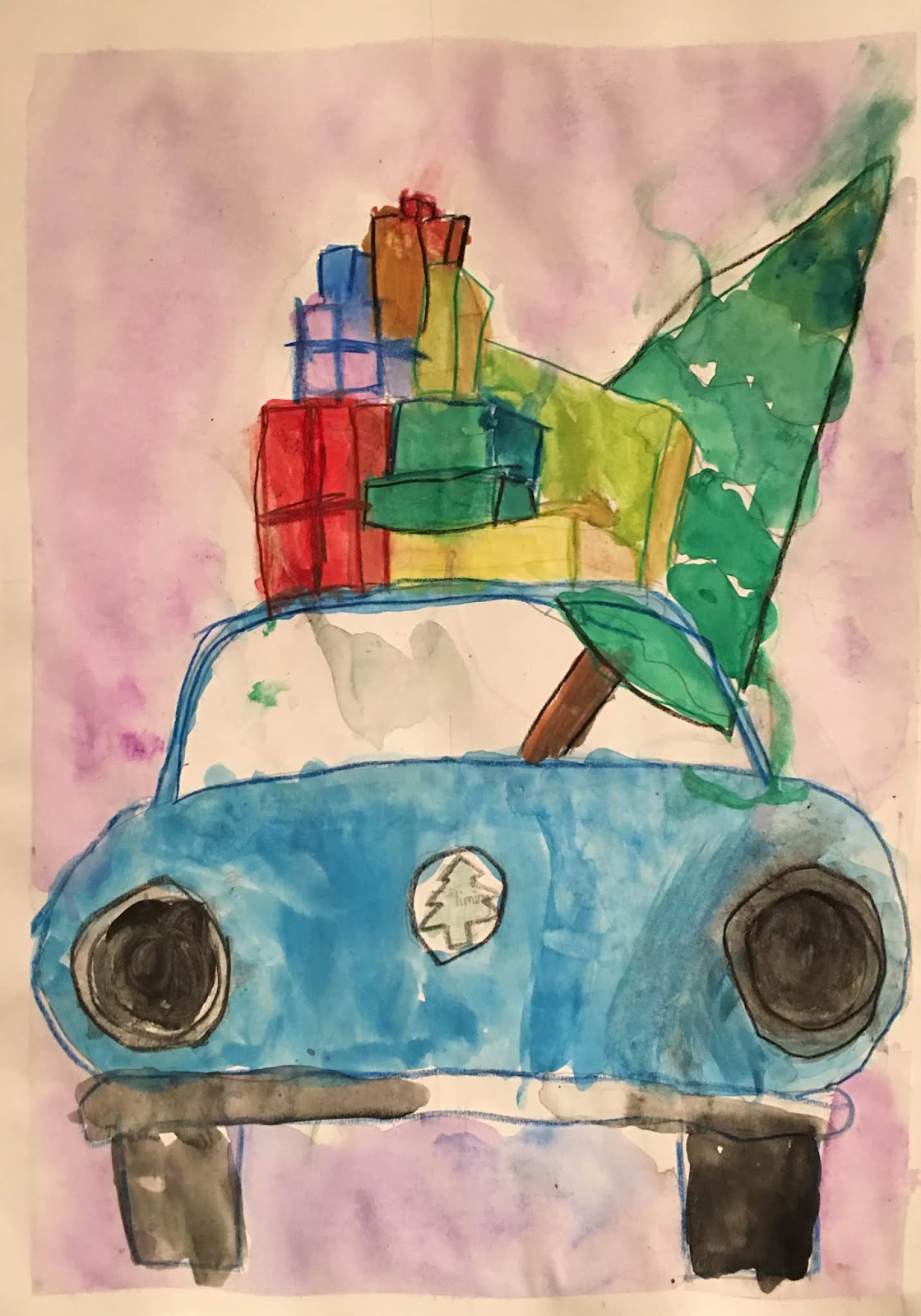
The 'Christmas car' thing is all over Pinterest in various renditions. Whimsy watercolor illustrations, bold acrylic paintings, children's art projects, and more. I concluded that, properly conceived, this project would rehash many of the skills we learned over the last semester. So I decided to tackle this idea with my kids using watercolor, colored pencil and pen. We would address value and shadowing with our media, and we would be mindful to draw with care, and with attention to detail and function. Additionally, students would learn a new skill: how to draw presents using 1 point perspective, creating a 3-D stack of boxes. Lastly, students would have to think like designers and figure out how and where to incorporate a Christmas tree into their car: where looks good, what makes sense, where does it fit, etc.

To begin, students looked at illustrations of Christmas cars, complete with presents and a tree, just to get a sense of what their possibilities are. We then looked at drawings and photos of different cars from various angles. Students sketch out a few drawings of cars exploring different styles and angles. While I was prepared to teach kids how to draw a car from a 3/4 angle, using two point perspective, students did not choose this more difficult option, which I was kind of relieved about, since it's quite complicated. I'll save this lesson for another time!
We practiced drawing boxes with 1-point perspective, and overlapping these.
When we were confident with this, we got to work.

Objectives:

Draw a car (style and angle of your choice)
-Include details.
-Think carefully about symmetry!

Draw 5-7 presents on top of the car.
-Overlap presents.
-Draw them for a 3-D effect (1 point perspective)
-Think about variety (vary size, shape and angle)

Include a Christmas tree somewhere.
-Think about composition: Where does it look good? Where can you fit it in? What would make sense?

Mapping out our main features:
The car should consume the bottom half of the paper, and the presents and tree on top should fill the top half of the paper. Breaking this down for kids helps them get the sizing and scale of their main features right. Otherwise cars will be drawn too small. We still had some issues with presents being drawn too small, and these students were encouraged to draw bigger... we don't want teeny presents on big cars, or tons of empty space at the top of the paper.

Drawing:
Cars were drawn in pencil with attention to detail, form and function. Presents were then stacked on top of the car, with some presents showing their side angle as well as their front angle.
I reminded kids that generally, presents should be stacked from big up to small. For good and interesting composition, presents should come in a variety of sizes and shapes. I also encourage kids not to put a bow or ribbon on every-single-present (they will try), as this quickly overwhelms the eye. The kids totally got this point and generally balanced out their used of ribbons.
Once the car had a good stack of presents on it, students had to think about where, and how, to fit in their Christmas tree. This required them to think about composition and scale: where do I have space, where makes sense, what would look good.... thinking like designers!


Students had the option to trace their pencil lines in black fine liner permanent marker, or to leave the tracing for later, after painting, using colored pencil.

Painting:
Students used watercolor in sheer colors to paint their cars and presents. A slightly darker value was then added wherever there might be a shadow. Going from light washes of transparent color to increasingly more intense color is the ticket with watercolor! For the presents, to get that 3D effect on their presents, a tiny bit of brown was mixed in with their main color. For example, if the front of their present is blue, then the side of their present will be blue plus brown. This darkens the value and instantly gives the box dimension.

Students had the choice to either paint their ribbons and bows with a fine detail brush and a more intense application of watercolor, or in colored pencil.

Trees were painted similarly: from a light value of transparent green to a darker value, slowly building on shadows. We mixed blue with our greens for a deeper, cooler evergreen color. We used our brush to flick lines outward for that tree texture. Colored pencil was also used over top, once dry, for added tree texture.

*Tip: for painting the windows, simply paint a dash or two of really light transparent gray across the window. Less is more, and it does the job beautifully.

Outlining/Defining:
Once all elements were dry, students outlined their car and presents in colored pencil, if they hadn't already outlined with fine line marker. The key is to use a similar but darker color to outline each element, so if the car is red, we outline it in dark red. If the present is purple, we outline it in dark purple (or dark blue - whatever is close but darker to the original color). This gives instant emphasis and definition without creating too much contrast - a nice touch.

Backgrounds were painted in wet-on-wet in a light wash of a color that 'looked good' with our composition.

All my kids classes did this project with success and they all enjoyed it. There was plenty of opportunity for individual choice and expression.

*My little class (ages 7-8) used larger format paper (roughly 12x18 inches, or A3) and they did not use fine-liner pens to outline, but only colored pencil. Otherwise, the approach was the same for both my age groups.


Pheobe 10
Sif 10
Sofia 8
Skye 9

Sif 10

Ciara 8
Ella 11

Ben 10
Dasheng 11
Anastazia 9


Marko 14
Liv 10
Rune 7
Aditri 8
MeiMei 8
Daniel 8

Yiming 7


Wednesday, December 5, 2018

Jen Aranyi Mountain-scape Mixed-Media Illustrations


Student work

 
I discovered Baltimore-based artist and illustrator Jen Aranyi on Instagram a while back. Pen and watercolor is a favorite media combination of mine, so her work really resonated. I've done many projects with my students over the last year using these two media together, and I knew my kids would love her work. So, when I wanted a quick one-class winter-inspired project, I knew this was it. To build a holiday gift option into the project, I decided to give the kids the option of making bookmarks..... so I dusted off my lamination machine and off we were!

Jen Aranyi works in small format, so we did too. This also allowed us to each do two illustrations, which the kids loved. How often do they get to go home with two artworks!?

Process:
We discussed Jen Aranyi, her work, her use of line, her subject, her media and her watercolor technique. My kids knew right away that the watercolor sky was done wet-on-wet, and that she used white gel pen (and maybe salt?) to add texture and stars in her sky. The artist actually uses a watercolor pen brush (which we don't have), but a wet-on-wet technique with a normal paint brush does the job just fine.
I passed around many printed visuals of Jen's work. Students took inspiration from several of her works and created an original piece. They sketched out a few ideas on scratch paper.


Objectives:
Students could make either 2 bookmarks (roughly 2.5x8 inches), or 1 larger illustration (A5 size = roughly 5.5 x8 inches)... If time allowed, one more bookmark could be made.

Students had to think carefully about detail, line quality and pen techniques (stippling and hatching). As always when using fine liners, we use various point widths (from 0.1-0.8). Larger widths are used for the bolder or main part of our illustrations (contours of the mountains, dark evergreen trees), and smaller widths are used for smaller subjects, details or texture (crags and line texture in the mountains, small cabins or houses, etc.)

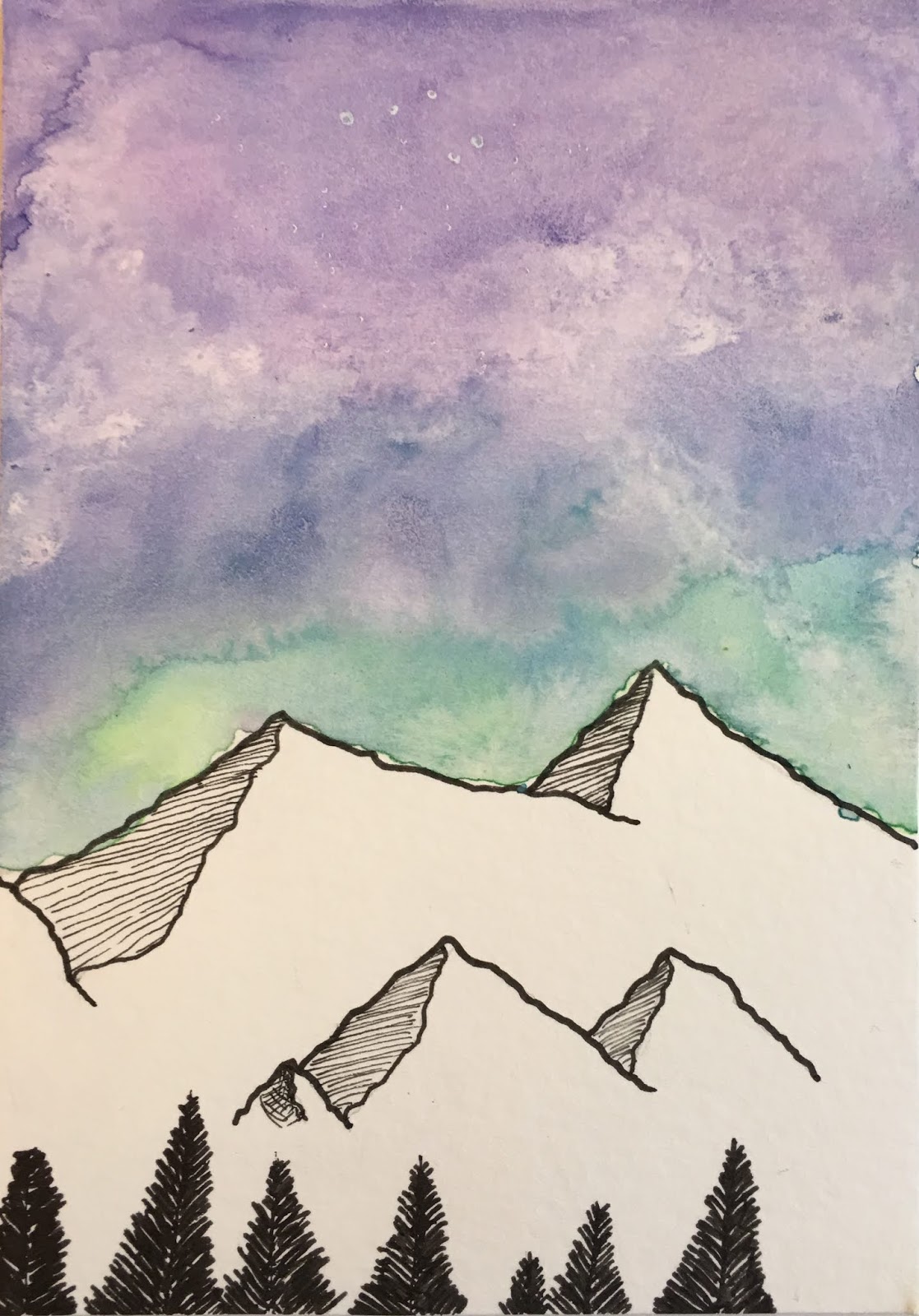
Most students wanted to include a mountain in their illustration, as this is a Jen Aranyi classic. I demonstrated on the white board how to draw the mountains with their textured side. I had students start at the mountain's highest peak, draw a jagged line downwards and then back up to the neighboring mountain's low peak (see example below). This space is then carefully shaded using closely spaced lines (hatching). Students got this pretty quickly, with a little practice. Minimal stippling was used here and there for added texture in the mountains and elsewhere in the illustration.

Then I showed students a few videos of Jen painting. She posts a lot of quick videos on Instagram showing her process. They found this fascinating and were super exited to begin on their own piece. See an example of her process here.

We got to work. Students first drew their mountain or other main subject in permanent fine line markers, then watercolored their sky. We used analogous colors and started at the bottom of the sky in a light color (for example yellow) and worked our way upwards to a darker color (dark blue).
We dabbed with a tissue for texture in the sky (the milkyway, clouds, or nebula), and sprinkled salt.
Then we moved on to our details at the bottom of our illustration. Once the sky was dry we added evergreen trees using a wider tipped fine-tip marker, and any other details were added to our scene.

Final touches: Students added stars in the sky with a white gel pen.

The bookmarks were laminated and hole punched, and students chose a string to pull through it.

Super fun and pretty quick. Many of my students went home so inspired that they kept making more and more of these illustrations and book marks on their own. This is the best feeling for a teacher: setting kids off on their way to be independent and curious artists! Thanks Jen Aranyi!


Winter Birch Trees with Cardinals - Mixed Media

The birch tree theme is perfect for the fall and winter. I have done several renditions using a credit card to scrape on the birch tree texture with black paint, both in watercolor and in acrylic.

Teacher Sample

I decided to try out a version in watercolor with my 7-8 year olds.
I knew they would enjoy the 'alternative' painting tool (credit card!) and other tricks, like masking trees with masking tape and painting with a sea sponge.

Indeed, they enjoyed all the steps involved, but I found that our overall results were undeveloped and somewhat bland. This is when I decided to have them work on these pieces another day and add more detail, vibrancy and contrast with mixed media.

Day 1
Masking trees
Students pasted 1-2 large strips of masking tape on their papers, from the center of their page going off the top of the page. These are the large trees in the front.
Students pasted 1-2 medium strips of masking tape, with the bases starting a tiny bit higher than the first strips. These are the mid ground trees.
Students pasted 2 thin strips of masking tape, with bases slightly higher than the middle strips. These are the tress furthest back in the distance. Doing these steps creates a sense of depth.

Sky
Students painted their sky using a sea sponge and lightly dabbing blues and purples all around.  The sponge should be only very slightly moist, and not too wet, so the paint is not too thin or watery. This way the sponge reveals its texture and the paint is more vibrant. This is dried.

Tree
Masking tape is removed, starting with the thin, back trees first. These back trees are painted with grey paint (blue plus brown). Credit cards (which I had cut down into smaller strips) are used to scrape the paint on our trees. Simply line the edge of the credit card up with the edge of our tree, and scrape it midway across the trunk. Repeat all the way up, and again on the other side of the trunk. Students were encouraged to go for variety and achieve random bark effect, for a more natural look.
Tape is removed from the middle trees, and steps are repeated.
Tape is removed from the front trees, and steps are again repeated.
I encouraged kids to make their paint darkest for the front trees, (so adding a touch of black) for atmospheric perspective, and to offset these from the back trees.

*Some students had a hard time scraping the paint, and keeping it neat. I reinforced the importance of keeping the credit card lined up RIGHT on the contour line of the tree, not short of it or outside of it. *Some students were also too systematic with their scarping, and they created what looked almost like a ladder (perfectly equal applications of paint, and not natural-looking bark). I encouraged working in some more natural looking marks to break up the 'perfect' bark.
*I found having students use their credit card edge to dab paint along the full contour line of their trees made for a more pleasing appearance and made it easier to distinguish one tree from the others.

For a video on this technique visit here.

Foreground
Students use a flat brush and paint tree shadows using a light wash of blue-grey color (we mixed blue with brown to get our gray). Shadows are just painted in a diagonal line outwards from the base of the trees.

Blue-grey paint is dabbed around the base of trees, to give them some grounding.

Paint is lightly dabbed here and there to create the illusion of snowy mounds, and hilly shadows, but we left lots of space paint-free (white) for the snowy look.

This is what we completed in day one, but I knew we needed a pop of color and some emphasis to bring it all together.

Day 2
Students were given red, orange and yellow gouache paint (you could use acrylic). They painted small leaves using a medium round brush (just dabbing the paint on) in both bottom corners of their papers and reaching up the sides a bit. They had to think about variety (in color and in size).

Blue-black paint was used to dab smaller leaves at the bottom-center of their paper, and overlapping into the red and orange leaves a bit. Again, leaves should be in various sizes, and going in different directions (movement and variety).
These leaves should create the illusion of fall leaves at the foreground, growing up into our field of vision.

Cardinals
Students drew 1-2 cardinal birds in pencil on small squares of mixed media paper. Birds must be small, to fit to scale with our trees, so giving them pre-cut small squares of paper ensures that birds are drawn the correct size. Students looked at many drawings and pictures of cardinals and drew from observation. Birds were outlined in thin fine liner permanent marker and colored in marker. Red, with a darker red for shadows, and orange for the beak.
These were carefully cut out and pasted on their foreground trees in a visually pleasing manner.

This project took two 90 minute classes. Had we had more time, I would have had the kids sprinkle some snow on their painting with a toothbrush, using white gouache or acrylic paint. Two of my students did manage the time to do this, but the others did not.

This was a fun wintery project with many techniques and media.


Aditri 8

Mathilda 7


Yiming 7

Daniel 8


Mei Mei 8

Rune 7 

Class collage