Tuesday, May 26, 2020

Plaster Head Hand Puppets

I like to always round out the academic year with sculpture. With many months of drawing, illustrations and painting behind us, it's time to start thinking 3-D and applying all the learning we've covered throughout the year. Sculpture makes us think about design, construction, form and functionality, while also requiring the exercise of skills from illustration and painting. With the addition of applying the core 'Art Room Britt' expectations of neatness, craftsmanship and diligence, this is a seriously full-bodied project. The results were just amazing. I was floored, and super proud of my kids. All my ages groups, from ages 8-14, made these puppets and had a blast doing it.

Teacher Sample
Teacher Sample
Teacher Sample


DAY 1:
We took inspiration from different hand puppets we found on the web, in addition to the puppets German-Swiss artist Paul Klee made towards the end of his life, together with his young son. We were going for something realistic though, and wanted to think about creating a head shape that includes a defined facial bone structure. This means: thinking about brow bones, nose shaft, cheek bones, chin shape and eye sockets. We looked at pictures of simple bone structure illustrations, and felt our own faces to 'feel' the cures and indents in our faces.

We then decided if we wanted to create a female, male, old or young puppet, and aimed to give our puppets a bone structure that fits this profile.

Bone Structure Differences:
Men have broader noses, stronger brow bones, larger and squarer chins, wider mouths and more set back hairlines. Females have smaller, more delicate and more rounded features, narrower chins and higher cheekbones. Children have rounder faces, bigger eyes, fuller lips, smoother skin, freckles. Older people have longer chins, longer noses, rougher skin..... these are, of course, all slightly hyperbolic samples, but still, they get the job done in helping to achieve a certain type of look.

Students created a neck out of toilet or kitchen roll - wide enough to fit at least two fingers into it. They then bunched newspaper into a softball sized ball, and started pushing paper down and pinching it up, and adding more bits of newspaper to create their facial bone structure. Clearly defined noses, brows, chins, cheeks and eye sockets had to be created. They taped everything down with lots of painters tape, to keep everything in place and to make a good, solid head. The neck was inserted into the newspaper head. These were securely taped together.

We covered our head and necks with plaster strips. We continued to develop our facial bone structure in this step, adding lips, nostrils, and any other features using plaster. These dried until next class.


DAY 2:
Painting the face:
Students mixed their own skin color using acrylic paint in pinks, yellows, browns, ochres, and white. Faces were pained, and cheeks were given a splash of color. With a fine detail brush, students painted eyes, brows and lips. Lots of attention was given to neatness and precision in this step. Special care and attention was given to the eyes and the iris, to achieve a realistic and expressive look. Eyebrows were painted mindful of the expression created with differently shaped, placed and sized brows.

Preparing the puppet dress:
Students chose fabric for their puppet's clothes. Using a simple dress pattern I created, they cut out a double piece of fabric for the front and back. Some students sewed these two pieces together at home during the week. For those who do not sew, I sewed their puppet dress myself and had them ready for them on our last class.


DAY 3:
On our last day, we put everything together. We added hair, clothes and any other accessories, such as glasses, pockets, ribbons, bow-ties....

Hair:
Students could choose from a coarse hemp (which I had saved from packaging insulation), or yarn.
-Hemp was piled onto the head and formed into a hairstyle, then glued down onto the scalp and hair sprayed for a secure fit.
-Yarn was more complicated: we wrapped yarn firmly and evenly around rectangles of cardstock and secured our wrapped yard with tape. Using the sewing machine, we sewed up and down twice along the middle of the cardstock to create the 'hair part'. We then clipped the edges of our hair and carefully tore away the cardstock. We placed the hair on the puppet heads, and glued the hair line down with a glue gun. Hair was braided or gathered into pigtails, and secured to the head with a glue gun.
Dresses were fit around the neck of our puppets and secured with a glue gun. Collars, bow-ties, neckties, ribbons, and hair wraps were added. For those who had time, wire glasses or monocles were created.

These puppets turned out so beautifully! The attention to neatness and expressiveness really make them professional looking little theatre puppets. We all had such a blast creating these!


Monday, May 25, 2020

Elizabeth St. Hilaire Collage Fish - Mixed-Media

Collage Mixed-Media Fish. Kids 7-9

Elizabeth St. Hilaire makes the most beautiful painted collages. I find her use of color, texture, and pattern thrilling and inspiring. See her work here. 

I wanted my kids to explore painted collage and knew this was the direction I wanted to go in. 

 This was a super fun project that my youngest age group (ages 7-9) really enjoyed. It's a relatively simple project with big results. They could get their hands dirty, rip and tear paper, stamp and print with different materials, and in the end, create an adorable, bright fish. 

A fish is a good subject for this project because of its simple and easily recognizable shape. With a simple contour drawing of a fish, my kids were ready to start collaging. 

1. Students chose a picture of a fish. They drew out the basic shape of their fish on mixed-media paper. The fish should be big and centered.

2. Student chose many different papers and started tearing (no cutting!) these papers to fill their fish. 
--Papers must overlap, so no white drawing paper shows through. 
They started with bigger bits of collage, and added smaller bits over top for detailing. Along the edges of their fish, they had to tear very carefully, and paste their paper right on the contour of their fish drawing. The goal here was to create a clean finish, so collage papers had to line up nicely with each other and flow into one another, in order to preserve the contour of their fish. 

--Students were encouraged to choose a variety of pattered and painted paper, and to repeat these papers at least once for harmony. A paper with lots of white must also be used, to provide for 'visual rest' in an otherwise very busy and bright composition. 

*This age group can have trouble tearing paper for precision. I showed them how to "pinch" the paper between both hands, using pointer fingers and thumbs, and make tiny short and precise tears. Pinched pointer fingers and thumbs of both the left and right hands should touch, as though they are "kissing".  This allows for a very small and precise tear.

3. The eye was painted with black acrylic paint and a detail brush. A white reflection spot was added.
4. The background was painted in a mix of blues, greens, yellows and white to create a soft turquoise color.
5. Once the background was dry, the fun started. Students chose different printing and stamping elements to add texture to their backgrounds. 
--Some items we used were bubble wrap, wine corks, lego pieces, corrugated cardboard and rubber stamps. 
--We used dark blues and greens for this, and them 'softened' and 'pushed back' these textures by painting another layer of light turquoise, light blue and white over top. This allows us to still see the texture underneath, but it's soft and subtle. 
--For a final texture touch, we stamped bubble wrap with white paint for some air bubbles. 
6. The last step was to emphasize our fish and allowing it to 'pop' by outlining it with a piece of vine charcoal. We lightly smudged the edges with our fingers for a soft finish.

We went home feeling proud of our adorable, bright, vibrant fish. The various textures and patterns give them so much interest! 

Thanks Elizabeth St. Hilaire!


Printing and stamping texture
Outlines with vine charcoal
Outlining with charcoal


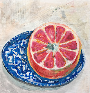
Polly Jones Mixed-Media Summer Fruit Still-Life


The Texas-based mixed-media artist, Polly Jones, paints the loveliest fruit still lives. I absolutely adore her use to color, texture and unexpected pattern. See her wonderful work here.

It had been a long while since my adults painted a still-life, and it was definitely on my bucket list. Rather than go for the usual, boring academic version, I thought I'd spice it up and use Polly Jones as our inspiration, while introducing some new media, some new techniques and a mixed-media twist.

Materials:
Acrylic paint
White gesso or primer
Wood block or acrylic/mixed-media paper
Texture or thickening paste
Paper scraps (book paper, news paper, dotted paper, atlas paper)
Palette knife
Brushes in various sizes
Teacher sample, work in progress. Day 1
Teacher sample, final. Day 2
Day 1: pencil drawing and college 
Student work in progress

Student work in progress


  • Students chose a Polly Jones painting to take inspiration from, or they made up their own still-life. 
  • We painted on thick 8x8 inch (20x20 cm) square wood blocks and primed these with white gesso.
  • We lightly drew out our composition in pencil. 
  • We pasted a few bits of paper into our fruit composition. Our approach was to paste paper wherever there is a deep shadow, or where you want a bit of texture or interest to show through after painting. For this, we used cut or torn dotted paper, book paper and atlas map paper. 
  • We began painting. 
  • In areas where we wanted extra texture, we mixed some modeling paste (you could use any kind of texture paste) into our paints. We either applied this with a brush or a palette knife. 

My students were very pleased with their results. These small format little works of art entice and pleasantly surprise the viewer with all their unexpected textures. The wood grain of the wood block, the bits of paper collage and the modeling paste all worked together beautifully to result in interesting, unexpected, delicious and summery fruit still-lives. 

Thanks for the inspiration Polly Jones!