Saturday, October 24, 2020

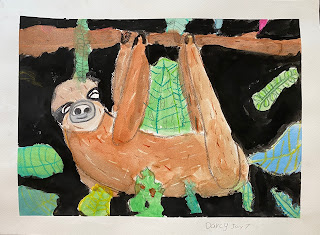
Hanging Sloth in Watercolor with Crayon Resist

Teacher Sample

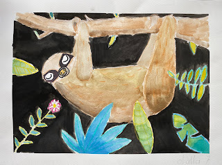
One of my students was desperate to do a sloth project, and made her wishes clear each time we met for class. Eventually, the whole class was behind this request. To appease their yearnings and fulfill their wishes, I developed this hanging sloth project using watercolor with crayon resist for my group of 7 year olds. The results were just amazing - too adorable - and the kids were wild for this project. They all went home to make many more sloths on their own. 


See my time-lapse video here for a quick overview of how we did this project:
Step 1: Drawing

Draw the sloth in pencil. Begin with very simple basic shapes: body shape (like an large kidney bean), then head (round, oval shape) with eyes and snout, then back legs (thicker at the thigh, thinner at the ankle, arms (thinner than the back legs), branch (curved and uneven, with knots and stubs), claws (three  pointy long fingers that are wrapped around the top of the branch. Refine all shapes for more accuracy. 

Draw several very large leaves which enter into the composition from at least three sides of the picture frame. Go for variety in shape and size. Leaves should both overlap and underlap the sloth to show depth.

Step 2: Crayon Contouring

Outline all the leaves, branch and the sloth in crayons. We used many greens, blues and yellows for the leaves, and added plenty of implied texture to the leaves indicating veins. We used many browns, black and white for the branch and sloth. Add fur texture to the body of the sloth using short dashed lines, and implied bark texture to the branch with short horizontal dashes. Be sure to use white in the sloth too, as this will show up nicely once the watercolor resists it. A ring of white or light pink can also go around the outside of the eye for contrast.

With a permanent black marker, color in the black part of the eyes and the eyeball (leave a reflection spot in the eye). This could also be done in black watercolor.

Step 3: Watercolor

Using many greens, blues and yellows, and mixing combinations of these colors, paint the leaves. Using different browns, paint the sloth and the branch. Think of light and shadows: The underside of the branch should be darker, and upper side lighter. The bottom of the body is darker than the top, inside of the legs are darker than the outer side, etc. The kids grasped this concept and rolled with it, and their sloths took on really good dimension. The face of the sloth is A very light brown or beige color.

Tip: Important is that watercolor is applied in light transparent layers, and darker values are slowly layered on. 

Step 4: Background - Negative Space

With a small, round brush, paint the negative space in the background in opaque black. Students were very careful to paint along the contour edges of all leaves, sloth and branch, and made sure to fill up all the small spaces between leaves with a small detail brush where necessary. If the black was not dark enough after the first layer, add a second layer of extra opaque black paint for super strong contrast. 

Optional: To fill up empty space in your composition, add additional simple details on top of the black with crayon where there is space (for example, thin twigs, long grass, etc.)

The kids were amazed by the magic of the crayon resisting the watercolor.

We took off the tape to reveal the crisp white border. My seven year olds LOVED this process, and were so proud of their results. One mom told me her daughter took her cherished painting to bed that night. Now that’s love!
Day 1 Progress
Day 1 Progress


Tuesday, October 20, 2020

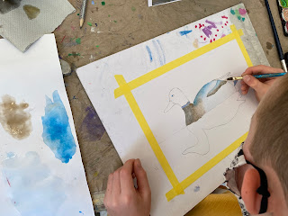
Mallard Duck in Watercolor with Masking Fluid

Teacher Sample

Teacher Sample


I thought it would be a fun challenge to introduce my 8-10 year old group to painting water in watercolor, with help of the magic of masking fluid. They'd never used this little trick before, so we had a good time exploring it, not only in our water, but in a few choice spots in our mallard ducks too. 

Why the mallard duck for this project? 
I love the the bold pops of green and blue color of this bird's head and chest, paired with the range of neutrals in his body. I knew this would be a good way for my kids to explore mixing and painting with various values of neutral tones, while also allowing them to play with the brighter colors in their palette.

Step 1: Drawing
Students chose a reference photo of a duck. Using light pencil, students each began drawing their duck by observation. A teacher drawing demo on the whiteboard helped them visualize how I drew out my own duck. We began with the general, large shape of the body (kind of like a football or almond), then the round head, connected to body by a sloped neck. We then refined these shapes and curves to create a realistic rendition of our duck. Placement, size and length of beak was analyzed, then the eye. Next we lightly sketched in other details, like wing, tail tuft, foot (if visible) and then the duck's reflection in the water.

Step 2: Masking Fluid
Students looked closely at their reference photo and used masking fluid anywhere on their drawing where there were bright whites. They added some swirls and curved lines in the water, and anywhere on the bird where they wanted to preserve these bright whites, for example in the tail area, a few spots on their body, the ring at the base of the neck, the white reflection spot in the eye and on the beak. We used a small detail brush or a toothpick to apply the masking fluid. These there then dried with the blow drier. 

Step 3: Painting and Neutral Color Mixing
Students began painting the body of their ducks using neutral colors. They were instructed to use all the browns and blues on their palette, with a touch of black to darken the value. 

Important tip: blues mixed with browns creates the most beautiful neutral, gray tones. Try ultramarine blue with burnt sienna for a deep, natural grey - MUCH better than just using black to create grey.

Students knew to use more water with less pigment for softer, lighter, more transparent color applications, and inversely, less water and more pigment for stronger, deeper and darker values. We slowly built up the values in our ducks this way, starting light and gradually adding darker tones and values. 

Moving on to the head, we mixed greens and blues, and started with a light application of this color, then gradually added darker values to create dimension. Beaks were done in yellow with a touch of orange. Eyes were done using a tiny detail brush and black paint. The bird's reflection in the water was painted the same way, but with a softer, looser, more blurry touch.

Students often had to be encouraged to go darker with their values. Deepening their browns with a dark blue and a touch of black was the ticket, and using more pigment and less water. As soon as they did this, they could see the strong contrast and dimension of their bird really come to life.

Step 4: Water
Students mixed a very light value of a blue-grey color (blue with some brown) and applied this across their whole background using the wet-on-wet technique. They gradually added darker areas of color in their water by mixing different blues, greens and browns, always referencing their photo for guidance. They were encouraged to apply paint in such a way that it mimics the movement of the water, so using curved lines and dashes to mimic the little swells in water.

Step 5: Erasing the Masking Fluid
Paintings were thoroughly dried with the blow drier, and then the masking fluid was rubbed off. This was done either by using our index finger, or with a rubber cement eraser. This revealed beautifully crisp areas of white. 

The success of this project surprised me - it was by no means an easy theme or an easy medium - but with some previous exposure to watercolor, and with strong step-by-step demos and guidance, the kids managed exceptionally well, and all went home proud as ever!

Class collage. Ages 9-10


Teacher step-by-step demo


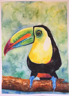
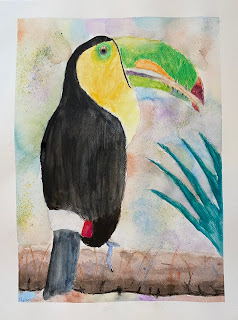
Toucans in Watercolor Pencil


Teacher Sample

I developed this project a while back, but never found a good time to run through it with my kids classes. After a few recent projects using watercolor, I figured it was now a good time to introduce my kids to watercolor pencils. They loved this project and their results were amazing.

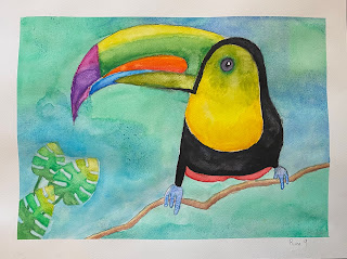
This project is a great way to explore the versatility and magic of watercolor pencils, and the theme is one that any kid can get behind. The toucan? What a strange and colorful bird! And the gradations and subtle color shifts in the bird's enormous beak is a wonderful way to explore creating color transitions, blending, layering, and creating both soft and hard edges with watercolor pencils.

Step 1. Drawing

Students each chose a teacher-provided photo of a toucan to take inspiration from. They drew this out lightly using pencil on watercolor paper. A teacher demo on the whiteboard helped them visualize how I would draw a toucan. Starting with the basic overall form just to get the size and placement down, then refining these lines and shapes, then addressing the enormous beak with it's curved upper beak, pointy tip, and straighter lower beak. It's important to get this beak step right, otherwise our toucan will not look like a toucan. We spent a good amount of time just on the beak, really analyzing its curves, features, and size relationship to the rest of the head and body. Then on to the rest of the features, including round marble-like eye, claw-like wrinkly toes, and the branch.

Step 2. Coloring, Dry on Dry

Students colored their toucan looking closely at the reference photo in order to match color, color transitions, value gradations, and color layering. We used dry watercolor pencils. No water yet! They simply approached this step as through they were using basic colored pencil techniques: layering, blending, using various degrees of pressure to achieve different color intensity and values. For the black body, students started coloring the body with a light layer of either red or blue, then colored over top with heavy black. The blue/red underneath creates a more interesting, dynamic black that appears less flat.... and in fact, we did see hints of blue or red under the black in our reference photos.

Step 3. Activating the Dry with Water

Once all our toucan was colored in dry pencil, we carefully activated the color with a wet brush. 

Important tips for best results: 

1. Start activating your lightest color first (for example, yellow, then orange, then red)

2. Rinse out your brush with clean water each time you switch to a new color, unless you want your colors to mix. If you activate green, and then move on to activate red without rinsing out your brush, you will end up mixing green and red together (= brown!)

3. Just like with watercolor, make sure different colored edges don't touch when wet, or they will bleed together. 

Step 4. Creating a Palette of Colors for the Branch

Student created their own 'palettes' using many neutral colors in order to create their branch. 

How? Take a strip of watercolor paper and color many squares of color using branch colors (grey, browns, ochres, yellows, some blues, black...). This is now your palette. Take a wet brush and active the square you wish to paint from, then apply your brush (which has now picked up color from your palette) to your paper and paint with the color collected on your brush. Do this repeatedly with all colors, creating branch and bark texture as you go. For ex: students use their brush in short horizontal strokes to mimic the growth of bark.

Step 5. Adding Leaves

Student had the option to add leaves in their composition. Important was that the leaves were large, since jungle leaves are large, and that they come in from one or more sides of their picture frame in order to create a fuller composition. These were colored dry, then activated with wet, just like the toucan.

Step 6. Background

Students created another ‘palette’ for their background using sky and jungle colors: blues, greens, yellows, purple. Using a wet-on-wet technique (wet the paper with clean water, then add wet color into it) students dropped these colors into their wet background for a soft, blurry effect.

Step 7: Sandpaper

While the background was still wet, students took a strip of sandpaper and sanded a pencil on it, dropping these colored pencil particles into their wet background. This creates interesting texture and color spots for an added touch of interest.


All my kids loved this project, and their results were absolutely stunning. They were amazed by the beautiful and versatile qualities of this cool medium.


Wednesday, October 7, 2020

Gingerbread House with Candy in Watercolor

Just before winter break, my kids classes (ages 7-14) made gingerbread houses with candy using watercolor. Our focus here was on creating a pleasing composition using a variety of elements (candy!). Everything we painted had to be edible - doorknobs, door mats, windows, footpaths, trees....so....  candy and cookies! We created realistic dimension on our glossy, sticky candy using highlights and shadows, and our snow (icing sugar) looks fluffy because we also added shadows using a faint blue. Our gingerbread does not look perfectly flat, rather, we dabbed with our brush in different ways to create that slightly lumpy cookie texture. In our sky we used the wet-on-wet technique and added salt for texture. Lastly, our houses and candy cast faint grey shadows on the snow for strong overall dimension. 
What a candy rush, and how festive!
Step 1: On an A3 watercolor or mixed-media paper, students drew a basic house with the front and one side visible. You could use 1 point perspective to do this 'correctly' but we just free-handed. I drew several examples on the board - basically, draw the front of the house (square) and triangle roof, then draw 3 parallel lines going back, then 2 lines that are parallel with the first roof and front panel lines, closing off the back side of the house.

Step 2: Students looked at many pictures of candy and gingerbread houses to inspire their own creations. Objective was to fill up the foreground and middle ground with sweets in a variety of shapes and sizes - this creates an exciting composition. Everything had to be 'edible' - students got creative with this - candy doorknobs, lollipop trees, peppermint candy walkway, cut-out cookie tree... Students drew in light pencil.

Step 3: Using watercolor, students began painting using watercolor technique: start with the lightest value (more water, less pigment). Gradually add layers of color to increase saturation or add more pigment where the object is darker - this will give a 3-D look. Browns were used to paint the cookie part. Students used a dabbing motion with our brush to mimic that uneven, lumpy cookie texture. On the candy students were encouraged to leave a tiny 'reflection spot' white for a bold reflection. Students used a very light grey (lots of water, almost no pigment) to add shadowing under all the features. A very light blue was used to create shadows on the white icing areas.

Step 4: For the sky, students used the wet-on-wet technique to quickly cover the sky space, and were encouraged to paint darker at the horizon line for greater contrast between sky and snow. They sprinkled salt on the wet sky for that starry night texture. 

So fun with so much room for creative thinking and individual direction. The kids loved this project! 


Tuesday, October 6, 2020

Silhouetted Haunted Spooky House


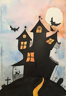
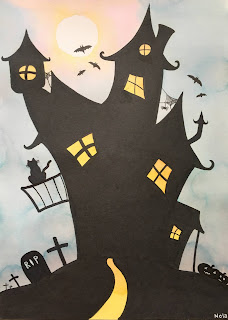
I did this project with my 8-13 year old kids around Halloween. We used thick and thin permanent black markers to draw and color the spooky houses. We were sure to make our houses look wonky with slanted sides and windows for that creepy, abandoned house feel. We went for variety in our windows, creating different sizes and styles, and added lots of little details on our roofs like spires, weather-vanes, cats, chimneys and spider webs. At the foreground we added graves, carved pumpkins, fences, etc.

The sky, path and interior window lights were painted with liquid marker ink, which I saved from dried markers. Simply place your dried markers, uncapped and felt tip down, in a jar of water and let soak for a day - you will have beautiful marker ink that you can use for painting.  The moon was simply drawn with round tracer and left unpainted, though you could paint it in with white acrylic paint.
These turned out so beautifully spooky and with such great contrast. The marker ink has a way of cauliflowering when it dries on the paper, which creates interesting texture, and adds to the night-time, spooky feel.